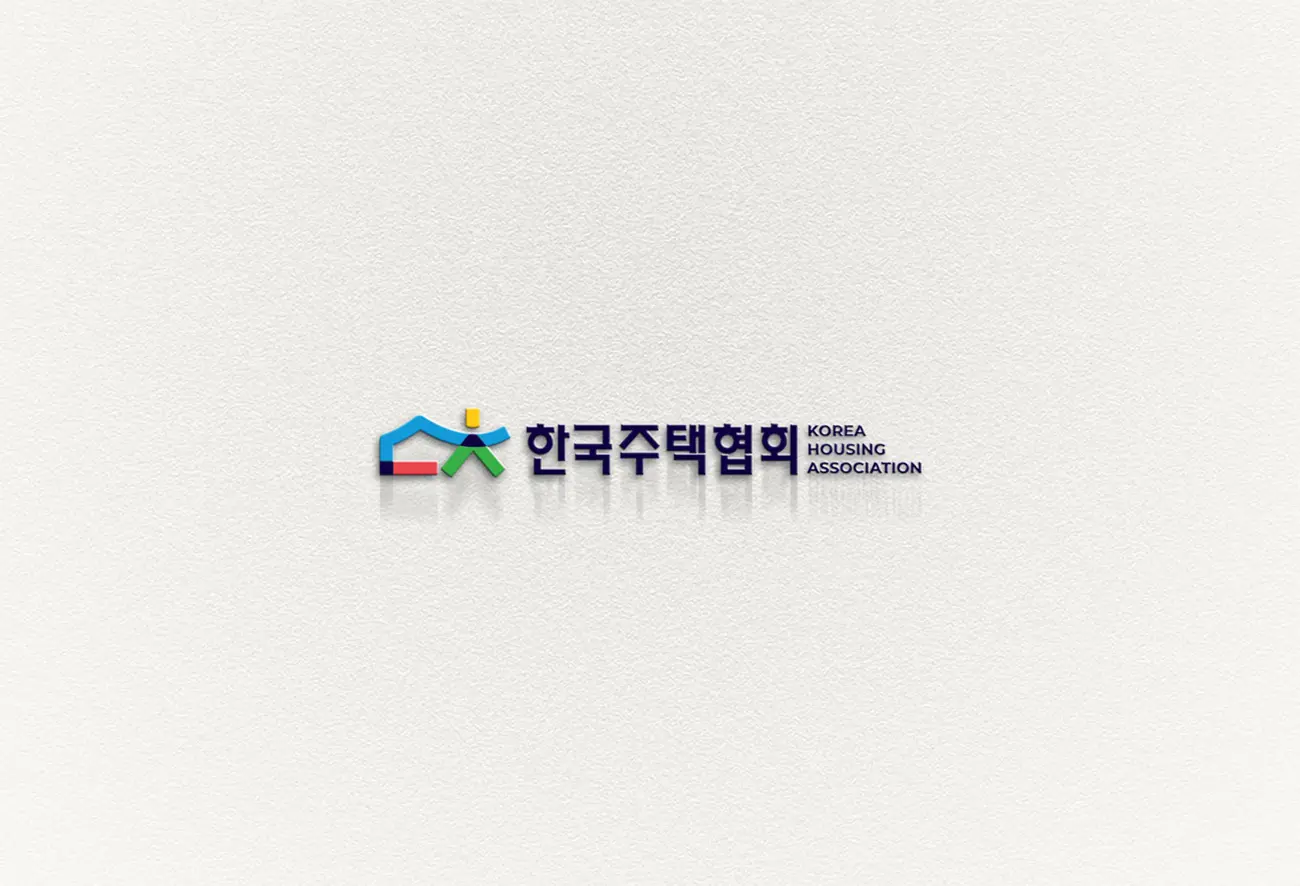
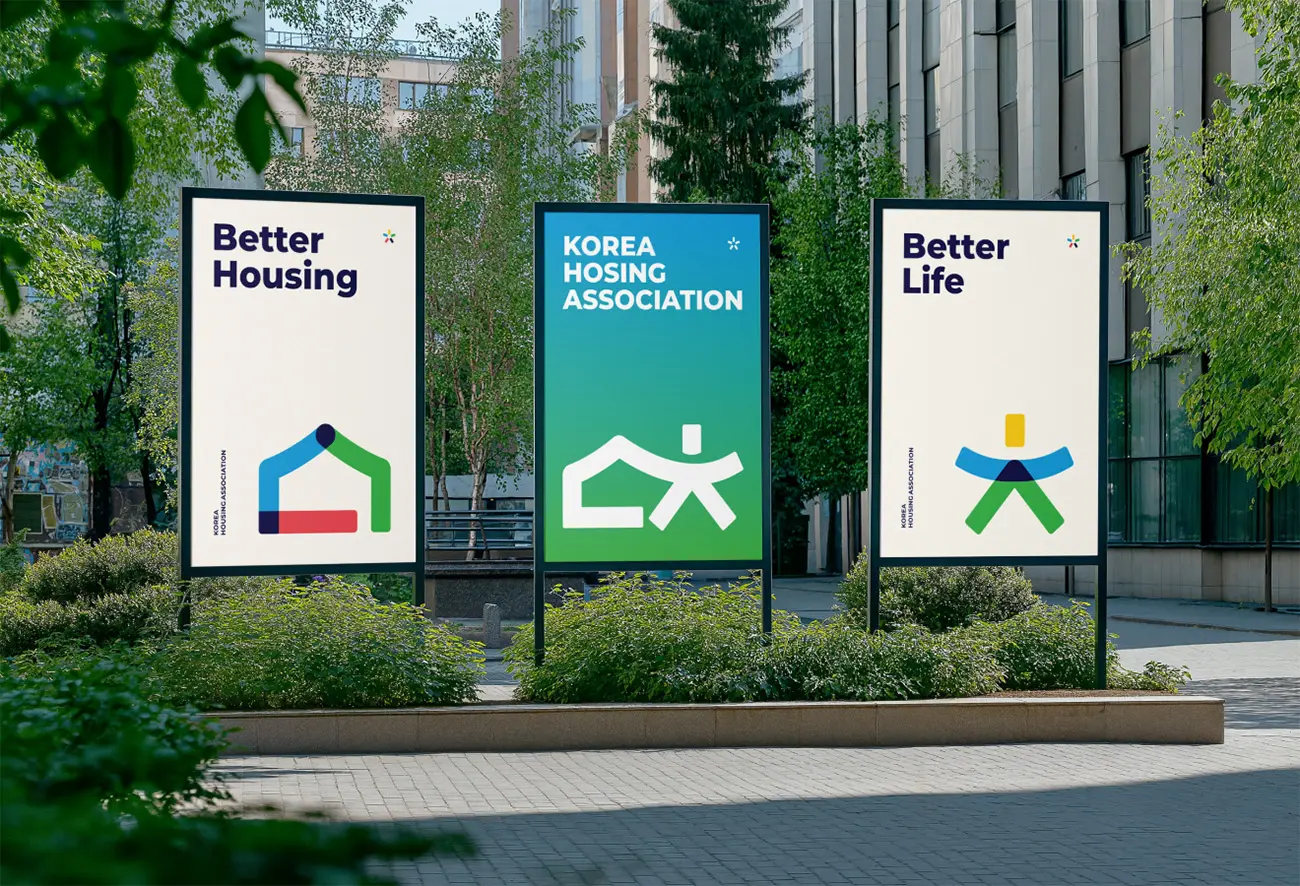
Since its establishment in 1978, the Korea Housing Association (KHA) announced its first comprehensive brand identity system renewal in July this year, unveiling a new logo and visual identity (VI) system. This initiative marks a new step for the non-profit organization in promoting the healthy development of the housing industry and enhancing the quality of residential living for the public.
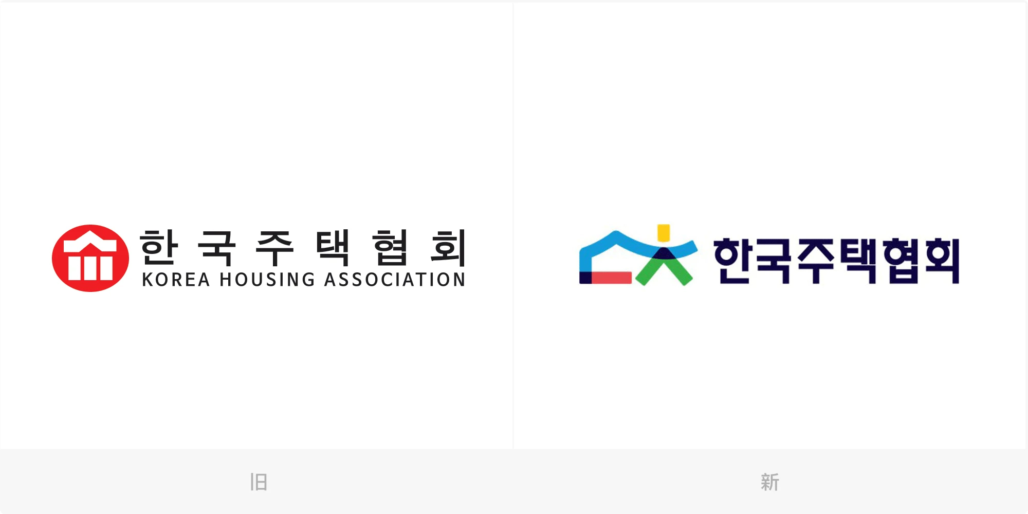
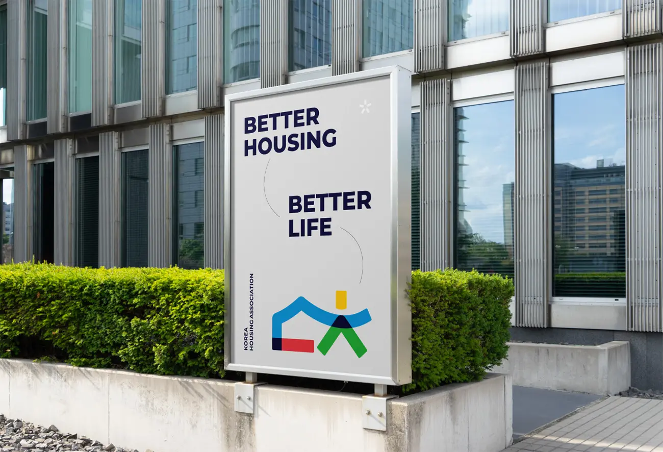
The new logo is built around the core vision of “Better Housing, Better Living,” skillfully integrating the two elements of “house” and “people” to reflect the deep connection between living spaces and individuals through an abstract yet modern design language. The graphic structure is simple yet dynamic, conveying the association's mission to foster harmonious relationships between people and their living environments, while delivering a unified and forward-looking brand message to both the public and the housing industry.
In terms of color design, the new identity adopts four core colors, each representing one of the association's four core values: blue symbolizes trust, conveying the reliable image the association has established with the public and its members; orange represents innovation, reflecting the driving force behind the advancement of the housing industry; green signifies collaboration, highlighting the multi-stakeholder coordination mechanism with government, businesses, and communities; and dark blue emphasizes responsibility, expressing the commitment to the future development of housing for generations to come.
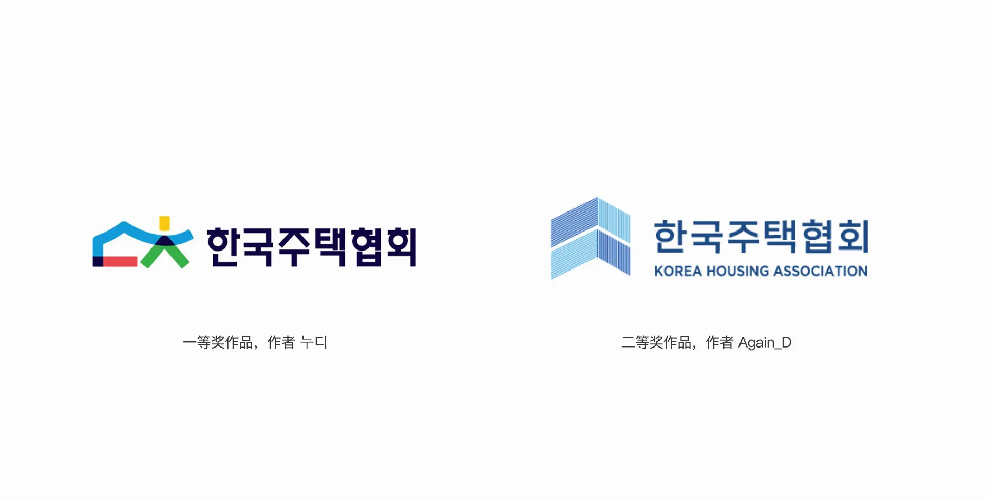
The new logo was selected through a public competition. The association, in partnership with an internet platform, launched a design contest that attracted a total of 447 submissions, from which two winning entries were ultimately selected. The total prize fund amounted to 7 million KRW, with the first-place winner receiving 5 million KRW (approximately RMB 25,000) and the second-place winner receiving 2 million KRW (approximately RMB 10,000). This process not only broadened public participation channels but also reflected KHA's open and inclusive organizational culture.
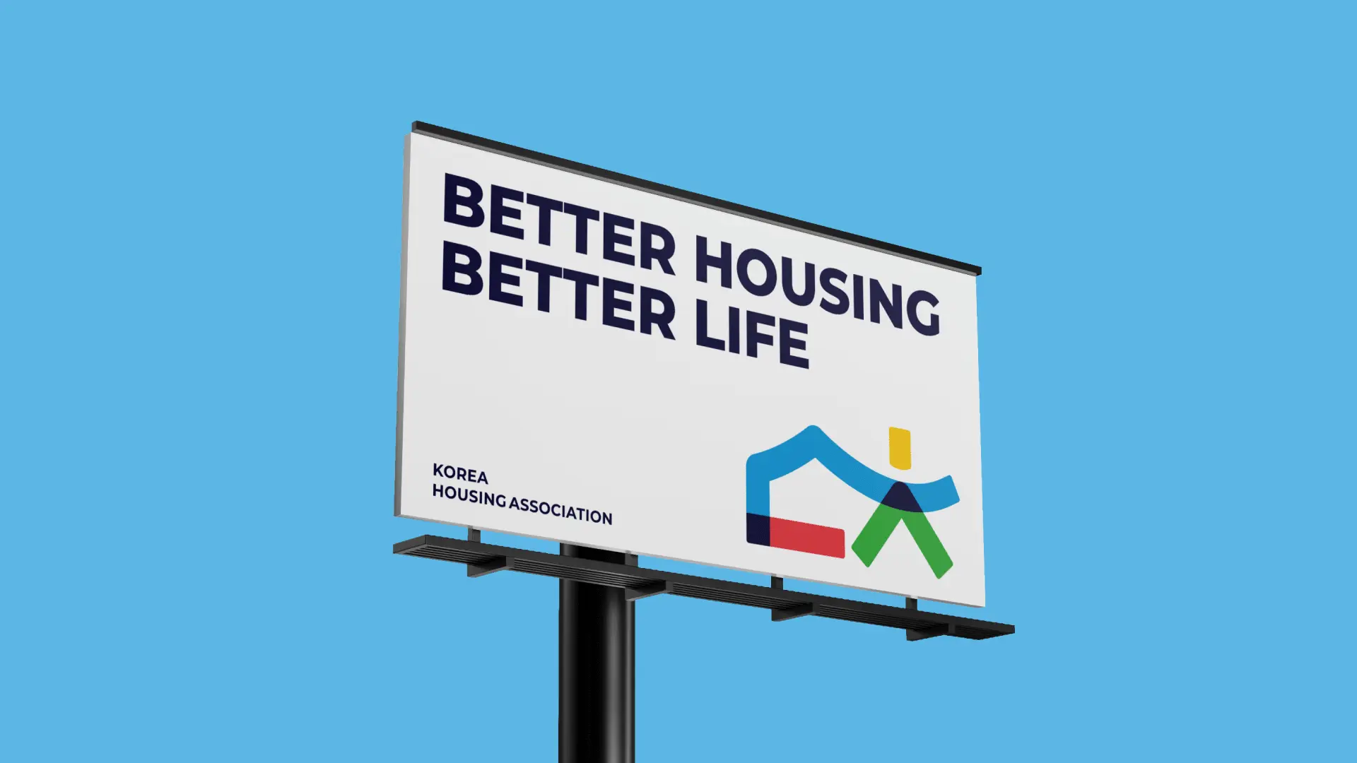
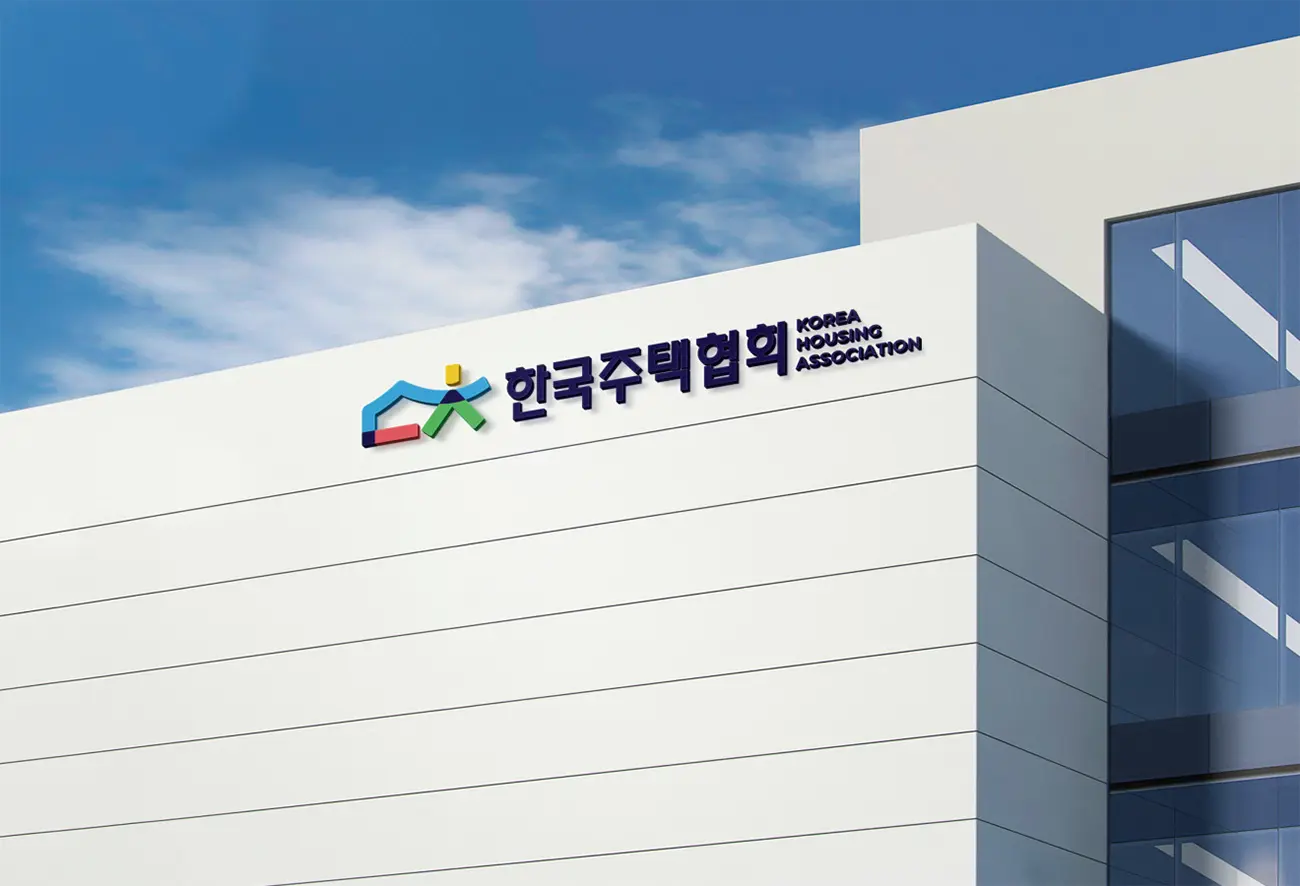
The new VI system has been officially applied to all visual touchpoints of the association, from documentation and materials to digital platforms, from event promotions to spatial signage, comprehensively showcasing the brand image of the Korea Housing Association as it enters a new era. This renewal not only infuses the organization with a sense of modernity and approachability but also better aligns with its positioning as a continued leader in the rapidly evolving housing industry.