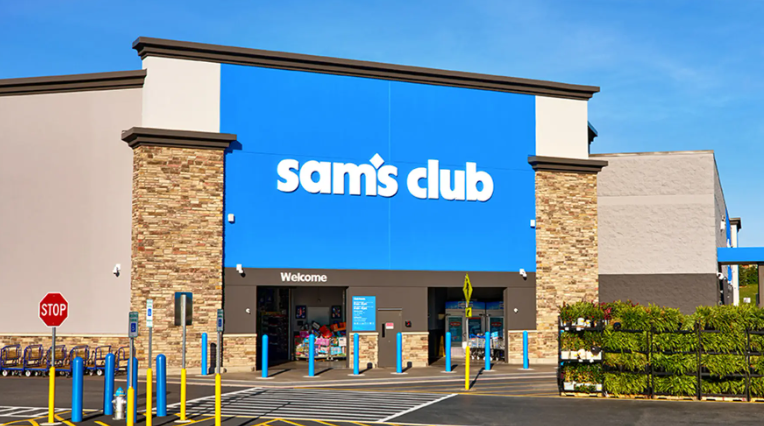
In May 2026, Sam's Club, a subsidiary of Walmart, launched a new brand campaign titled ‘Come Join Us“ and simultaneously updated its brand logo. The new logo retains the lowercase lettering and blue color scheme, but moves the diamond symbol from the right side of the wordmark to above ”sam's,“ with fuller and heavier typography, while the blue aligns with Walmart's high-saturation blue. However, this rebranding sparked considerable controversy among U.S. consumers: some criticized it as ”overly flat and lacking personality,“ with some even mistaking it for a generic app icon. This article deconstructs the three core design decisions behind Sam's brand upgrade from the professional perspectives of brand strategy and brand design, along with the industry insights they generate.
I. Design Decision One: Blue Unification—From “Sub-Brand Independence” to “Parent-Brand Asset Synergy”
The most immediately visible change in Sam's new logo design is the blue—shifted from the original deep blue tone to the same high-saturation blue adopted by parent company Walmart in its 2025 brand refresh. This decision carries profound strategic significance in corporate visual identity (VI) design.
Previously, as an independent sub-brand under Walmart, Sam's blue differed from Walmart's, intended to highlight its membership-based distinctiveness. The new logo's choice to visually “align” with the parent brand is essentially a strategic adjustment: reinforcing the “Walmart family” perception and sharing the trust equity consumers hold toward Walmart. Meanwhile, high-saturation blue delivers greater visual impact on digital screens, quickly capturing mobile users“ attention. From a logo design perspective, this color decision conveys ”belonging“ and ”modernity"—Sam's is no longer an isolated warehouse club but a more open and dynamic member of the Walmart family.

II. Design Decision Two: Diamond Relocation—From “Separated Graphic and Text” to “An Independently Communicable Super Symbol”
The old logo placed the diamond symbol independently to the right of the wordmark, resulting in a loose graphic-text relationship; the new logo embeds the diamond above “sam's,” creating visual integration with the letter “s.” This repositioning is the most artful change in this brand design.
First, the combination of the diamond and “s” creates an independently usable icon—suitable for app icons, social media avatars, membership card small-format applications, and other scenarios. In today's era of proliferating digital touchpoints, a symbol that can be communicated independently of the wordmark offers greater practicality than a full logo. Second, the diamond element has consistently symbolized “curated selection,” “quality,” and “members-only exclusivity” in Sam's brand identity; elevating and reinforcing it visually raises the priority of “membership value.” Finally, this nested “wordmark + symbol” structure is more compact and unified than a side-by-side arrangement, enhancing overall brand recognition coherence. Sam's clearly aims for consumers to recognize the brand by the diamond “s” icon alone when rapidly scrolling through mobile screens.
Logo design comparison from Sam's Club brand identity upgrade

III. Design Decision Three: Heavier Typography—From “Light and Approachable” to “Solid and Reliable”
The old logo's letterforms were relatively slender, carrying a certain approachability; the new logo employs fuller, bolder sans-serif typography with increased stroke width, giving the overall visual more “weight.” The brand strategy logic behind this change: the core value proposition of warehouse membership clubs is “bulk quantity, affordability, and reliability.” Heavier typography conveys psychological cues of “solidity,” “stability,” and “trustworthiness,” resonating with Sam's “curated selection” and “high quality” positioning. Additionally, bold typography offers superior recognition in large-format scenarios such as outdoor signage and billboards, and aligns with the prevailing flat design trend of “removing ornamentation, increasing mass.” However, this is precisely one source of controversy—some consumers feel that the heavier type combined with flat treatment strips the brand of some of its original retro character and handcrafted warmth.
IV. Controversy Insights: How Can Brand Upgrades Balance “Efficiency” and “Personality”?
The controversy sparked by Sam's new logo fundamentally reflects a common dilemma in contemporary brand design: when nearly all brands are embracing flat, minimalist, digital-first visual languages, how can brand personality avoid being “flattened out”?
The controversy centers on two points: first, “after the diamond was moved up, it looks like a generic app icon”; second, “the new logo resembles any other warehouse club, lacking distinctiveness.” This reminds designers: functional adaptation (small-format recognition, cross-media consistency) is certainly important, but brand design must serve not only “efficiency” but also “emotional memory.” Although Sam's old logo was also clean in design, it retained the complete wordmark with a separated diamond structure—that slightly retro “imperfection” was precisely what made it memorable. In pursuing modernity, the new logo may have over-sacrificed the details that made long-time users feel “familiar.”
Another insight: brand upgrades need to be paired with campaign storytelling. “Come Join Us” conveys an open, inviting sense of community, but without sufficient design interpretation of the new logo itself, consumers may easily see only “a color change” while overlooking the strategic intent behind it. When releasing a new identity, brands should simultaneously explain to the public “why this change was made” to reduce aesthetic perception gaps.
V. A Pragmatic, Function-Oriented Upgrade—A Question Left for the Industry
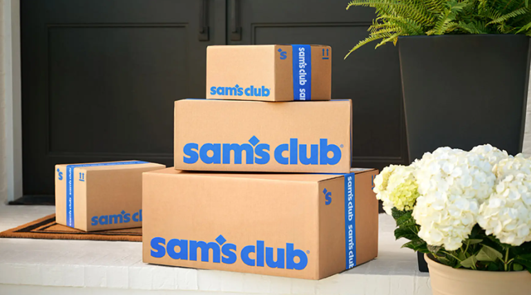
Sam's Club's brand identity upgrade is a typical example of “function-first” design. It prioritizes solving brand recognition efficiency issues in the digital era (independent icon, color impact, cross-media consistency), strengthens asset synergy with the parent brand, and provides a more open visual interface for the strategic transformation toward a “community-oriented membership brand.” Although it sacrifices some personality memory cherished by long-time users, it enables the brand to maintain highly consistent modernity across hundreds of touchpoints. For retail brands also undergoing digital transformation, Sam's case leaves a thought-provoking question: when efficiency and personality come into conflict, how will your brand choose?