One museum, two logos—one bears witness to history, the other embraces the future. In May 2026, the brand identity design for the new Dongguan Museum was officially unveiled, adopting a distinctive strategy of co-existing old and new logos, drawing industry-wide attention. What brand strategy logic lies behind this decision? How does the new logo convey Dongguan's landscape spirit through its “Grand Roof” silhouette? Why was the old logo retained? This article offers an in-depth analysis of the Dongguan Museum's brand renewal approach from a professional brand design perspective.
I. Project Background: From a Century-Old Institution to a New Cultural Landmark in the Greater Bay Area
The Dongguan Museum, formerly the Dongguan Museum and Library established in 1929, is the city's oldest cultural institution. In 2021, full-scale construction of the new museum commenced at the Dongguan Central Plaza, designed by He Jingtang, an academician of the Chinese Academy of Engineering and a native of Dongguan. The architectural concept is “City of Mountains and Waters, Layered Gardens,” with a total floor area of approximately 40,000 square meters—about 20 times that of the old facility. The new museum is positioned to "root itself in Dongguan, radiate across Lingnan, and reach out to the world," striving to become a high-caliber museum in the Guangdong-Hong Kong-Macao Greater Bay Area.
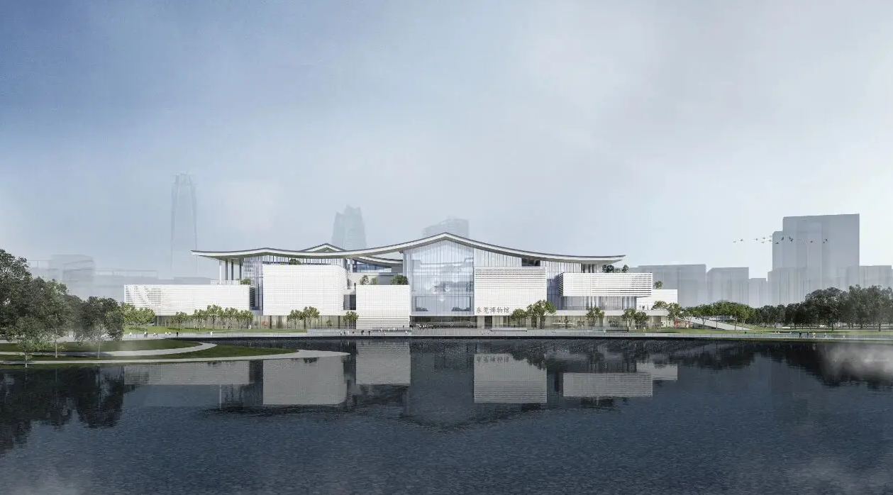
On May 17, 2026, the new museum's brand identity was officially unveiled. Unlike conventional brand upgrades, the Dongguan Museum did not replace the old with the new; instead, it adopted a dual-logo approach, allowing each mark to serve distinct functions across different scenarios. This decision provides a new paradigm for brand renewal among cultural institutions.
II. Co-Existing Old and New Logos: The Wise Inheritance of Brand Equity
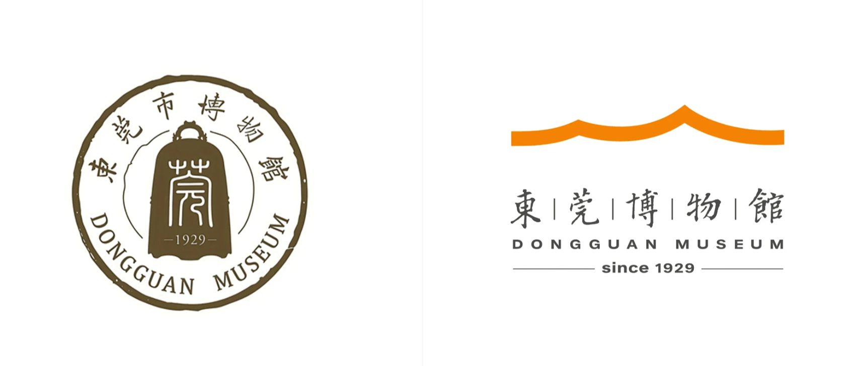
The old logo is modeled on the museum's collection piece, the "Yuan Dynasty Zhizheng Reign Large Bronze Bell." Cast in 1346 and weighing approximately 2.5 tons, the bell bears inscriptions of auspicious wishes such as "Favorable Weather" and "Peace and Prosperity for the Nation," serving as an important testament to the ancient Maritime Silk Road. Having accompanied Dongguan citizens for many years, this logo carries the public's familiarity with and trust in the museum. Going forward, it will continue to be used in operational management, academic research, and archival publications, preserving its historical depth and professional character.
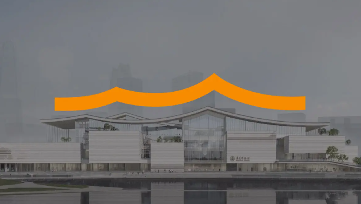
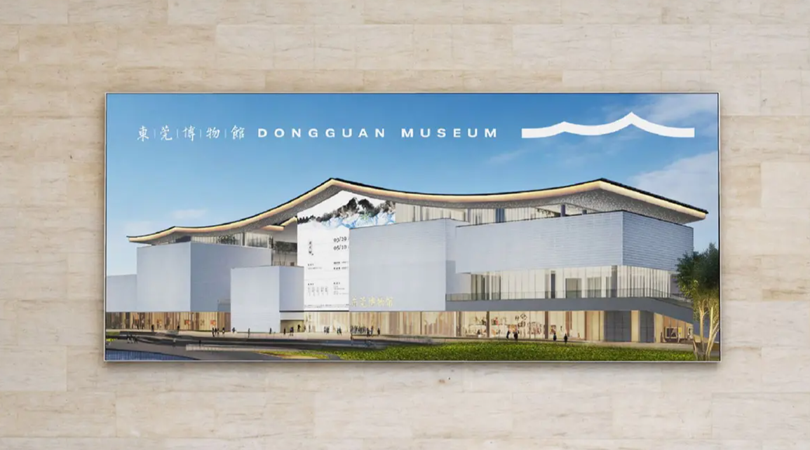
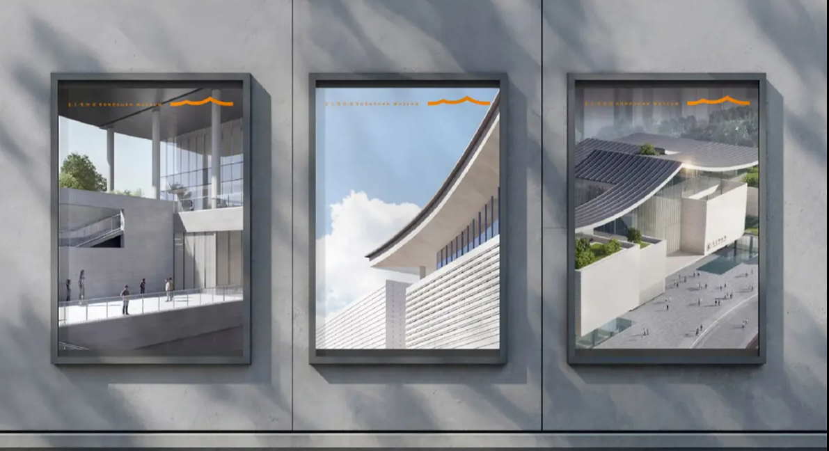
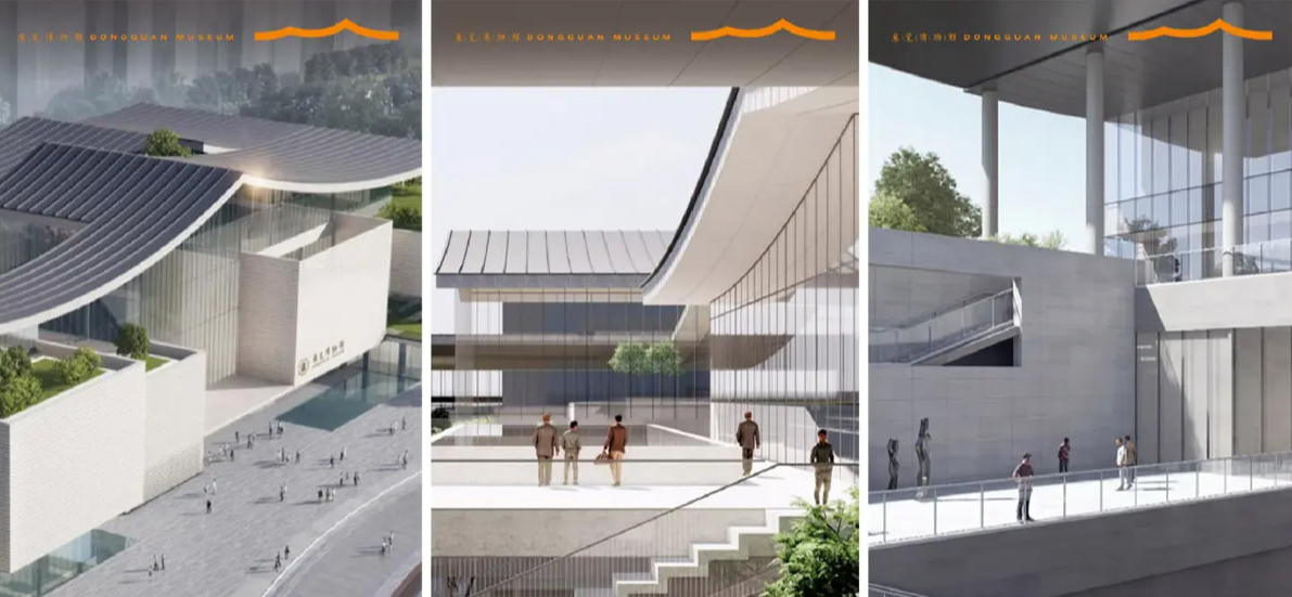
The new logo, by contrast, draws from the new museum's architecture, extracting the iconic “Grand Roof” silhouette through flowing orange lines, symbolizing openness, warmth, and vitality. The two logos assume different functions, yet both uniformly adopt calligraphy by Mr. Rong Geng, achieving consistency in the typographic system. This "dual-track" brand strategy—cherishing historical assets while embracing contemporary aesthetics—stands as a classic case worthy of reference in cultural brand planning.
III. In-Depth Decoding of the New Logo Design: The Translation of Landscape Spirit and Architectural Language
1. Graphic Symbol: Landscape Imagery within the Grand Roof
The new logo takes the “Grand Roof” silhouette of the new museum as its design origin. The undulating lines simultaneously evoke the letter “M” from “Museum,” echo the contours of Lingnan mountains, and resonate with the ripples of the Dongjiang River, reflecting Dongguan's geographic identity as a "City of Mountains and Waters." The continuous roofline symbolizes a cultural settlement, expressing the cohesive power of a thousand years of Dongguan culture; the upward-lifting line endings signify the city's spirit of openness, enterprise, and leadership. This "one form, multiple meanings" approach achieves a triple unity of architectural form, natural geography, and urban spirit within the museum's logo design.
2. Color Strategy: The Five-Color Extension of Vitality Orange
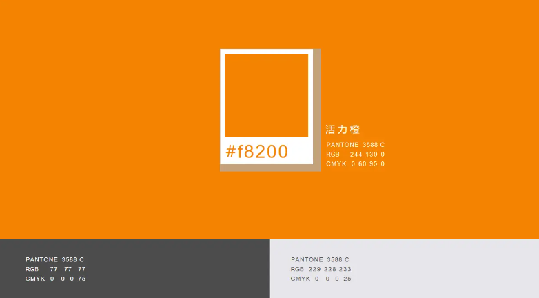
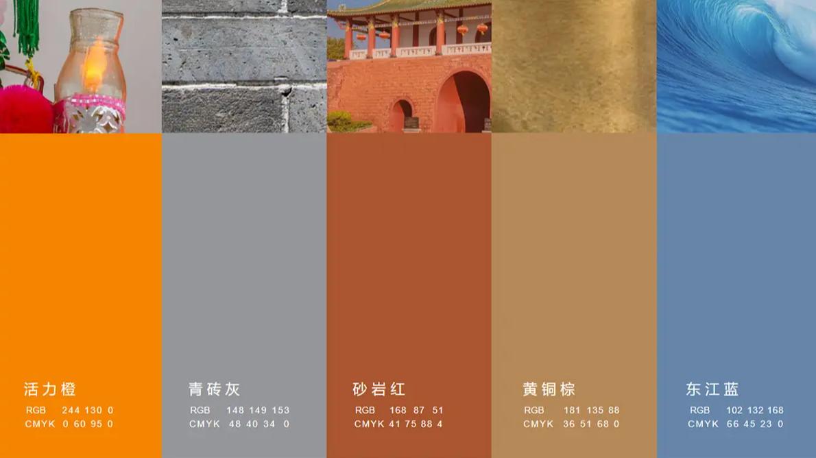
The new logo adopts “Vitality Orange” as its primary color. The design team imbued it with dual connotations: on one hand, “orange” (chéng) is a homophone for "sincerity" (chéng) in Chinese, expressing the museum's attitude of connecting with urban culture through authenticity; on the other hand, orange evokes flame and the rising sun, conveying warmth, approachability, and vitality. Around this primary color, the brand system extends into five auxiliary colors: Sandstone Red (derived from Dongguan's traditional architecture), Dongjiang Blue (echoing the city's waterways), Brick Gray (representing the memory of the old city), and Brass Brown (drawn from the texture of cultural relics). This color system is deeply rooted in Dongguan's local culture, giving the brand identity both visual impact and a sense of cultural belonging.
3. Typography: The Cultural Anchor of Mr. Rong Geng's Calligraphy
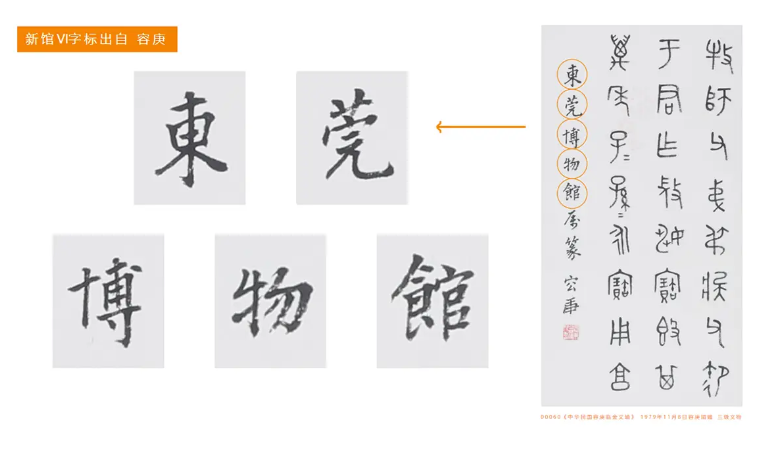
In typography, the Dongguan Museum selected the inscription "东莞博物馆" (Dongguan Museum) written by Mr. Rong Geng, a renowned native scholar. Mr. Rong Geng was a distinguished paleographer and epigraphy expert; his brushwork integrated into the brand system further strengthens the connection between the museum and the local cultural lineage. Both the old and new logos uniformly adopt this typeface, ensuring unified recognition at the typographic level and avoiding visual confusion.
IV. Professional Insights: The “Dual-Track” Mindset in Cultural Brand Upgrades
The Dongguan Museum's brand renewal offers three important lessons for cultural institutions:
Insight One: Brand equity should not be casually discarded. The old logo carries the collective memory and emotional identification of the public; forcibly replacing it may trigger public resistance. Retaining the old mark for academic, archival, and other professional contexts both respects history and reduces brand transition costs.
Insight Two: The new identity should resonate with the architectural space. The new logo directly extracts the silhouette of the new museum building, creating a strong association between the brand identity and the physical space. When the public enters the new museum, the intertextual relationship between logo and architecture will deepen brand recall.
Insight Three: Color and typography serve as carriers of cultural belonging. Details such as the homophonic resonance of “orange” with "sincerity" and the authentic calligraphy of Mr. Rong Geng embed local culture into the brand system, transforming the logo into a readable, perceivable cultural symbol.
V. Conclusion: Two Expressions of One Museum
The co-existence of the old and new logos at the Dongguan Museum is not a stopgap measure but a deliberate brand strategy. The old logo stands as a silent chronicler, guarding nearly a century of urban memory; the new logo acts as an enthusiastic guide, inviting the public into a fresh cultural space. The two are cut from the same cloth, each fulfilling its role, jointly narrating Dongguan's story from “history” to “future.” In the field of brand design, this approach demonstrates that the wisest brand upgrade need not overturn the past—rather, it allows history and the future to coexist harmoniously within a single visual system.