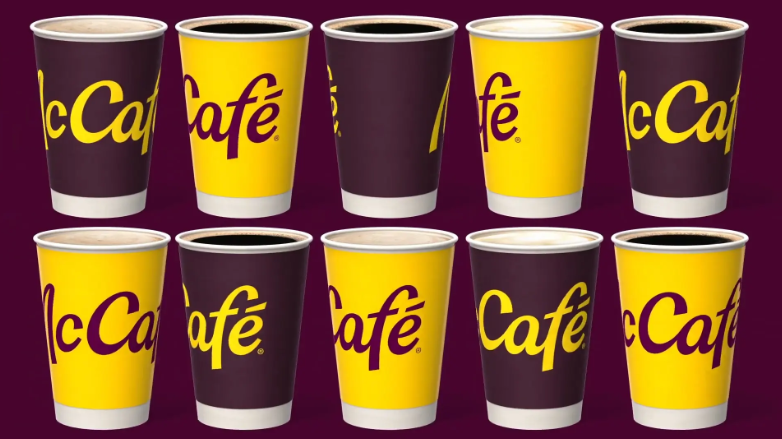
In May 2026, McCafé, the coffee brand under McDonald's, completed a global brand visual refresh. Designed by Turner Duckworth, the new identity retains the classic handwritten typeface but shifts the primary color palette from the deep green and coffee brown cultivated over many years to a combination of “coffee cherry red” and refined gold. This shade of red, derived from the coffee fruit, signals McCafé's strategic transformation from a “specialty coffee bar” to a “happy beverage station.” This brand image upgrade offers profound brand design insights for all food and beverage brands.
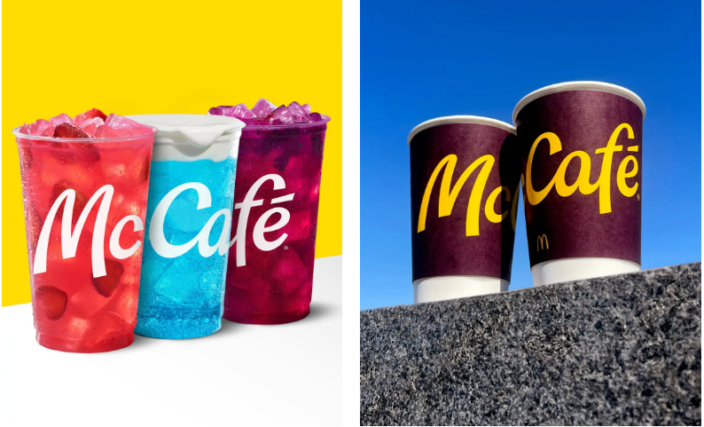
Insight One: Brand colors should evolve from “category colors” to “emotional colors”
In the past, food and beverage brands habitually used colors to express category: dark brown for coffee, dark green for tea drinks, orange-yellow for juices. This “category color” strategy was effective in the single-product era, but when brands expand their categories, colors become cognitive constraints.
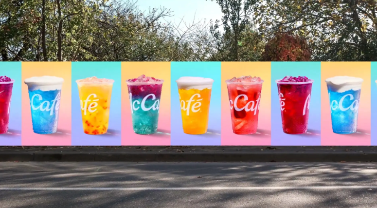
McCafé's deep green tone once perfectly conveyed the “professionalism and richness of handcrafted coffee.” However, when the product line extended to non-coffee beverages such as Refreshers, Crafted Sodas, and Energizers, the deep green could no longer carry the new category emotions of “freshness, joy, and diversity.” The design team did not choose to leap to a completely unrelated bright color, but instead extracted “coffee cherry red” from the red fruit that appears before coffee beans ripen—a color that both connects to coffee's “roots” and conveys vitality, freshness, and energy. At the same time, refined gold was introduced to create a family connection with McDonald's Golden Arches, with bright orange, refreshing blue, and other auxiliary colors added to build an emotional color spectrum for “happy beverages.”
Implication for food and beverage brands: When your product line moves from a single category to a composite one, brand colors must also shift from “telling consumers what I sell” to “telling consumers what feeling I represent.” Emotional colors offer greater brand extensibility and user resonance than category colors.
Insight Two: Wordmark optimization should “preserve the soul while injecting vitality”
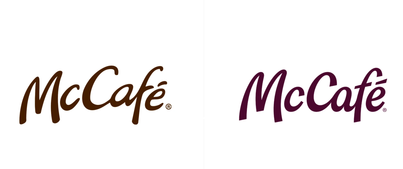
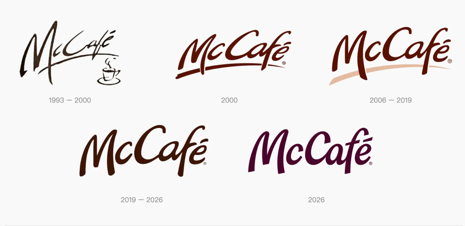
McCafé's new logo design did not overturn the classic handwritten typeface but instead underwent systematic fine-tuning: strokes became more crisp, letter slant angles were unified, and the overall rhythm became lighter and more upbeat; letters such as “M,” “C,” and “f” were given more expansive forms, with lines subtly echoing the curved language of the McDonald's Golden Arches.
This approach of “fine-tuning rather than overturning” embodies the asset preservation principle in logo design. Consumers still recognize McCafé, but it simply feels “more right.” For food and beverage companies with long-standing brand assets, a complete logo overhaul carries extremely high risk, whereas refined “polishing” while preserving core recognition can often achieve brand rejuvenation at lower cost.
Implication for food and beverage brands: Brand upgrading does not mean starting from scratch. Identify the most firmly rooted brand memories in consumers“ minds (such as McCafé's handwritten typeface), then modernize the details—adjusting letter spacing, optimizing strokes, unifying slant angles. This ”precision refinement" strategy both extends trust and injects vitality.
Insight Three: Visual systems should evolve from “static logos” to “dynamic frameworks”
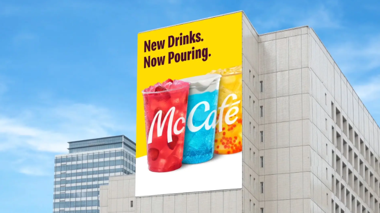
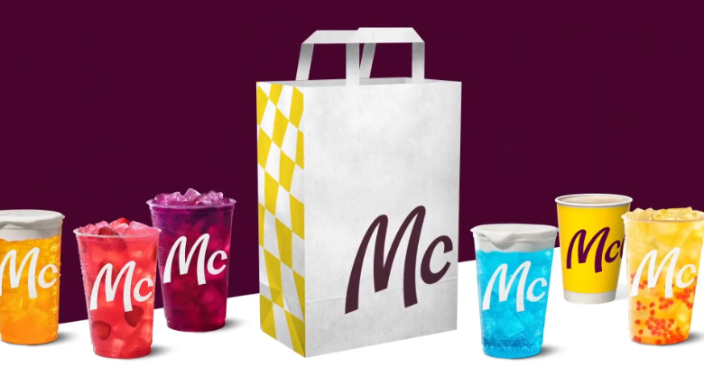
The new McCafé no longer has just a fixed logo, but an expandable visual system: primary color + auxiliary color group to address different beverage categories; unified wordmark + localized adaptation to address global markets; the relaxed feel of handwriting + the orderliness of geometric organization to address diverse touchpoints.
More importantly, this system reserves room for growth for future product lines. When McCafé launches new seasonal specialty drinks, it only needs to extract new colors from the auxiliary color group to naturally integrate into the brand system, without redesigning from scratch.
Implication for food and beverage brands: Food and beverage brand design should not be just a VI manual, but a “brand operating system.” It needs to include color variables, graphic modules, typographic hierarchies, and application rules that can accommodate product line expansion, seasonal changes, and regional differences. The more flexible the system, the more enduring the brand.
Insight Four: Sub-brands and parent brands should be “harmonious yet distinct”
McCafé's new design cleverly extends McDonald's “i'm lovin’ it” joy DNA. The flowing curves of the wordmark echo the Golden Arches, and the use of refined gold creates a color family connection with McDonald's. At the same time, McCafé possesses its own independent “coffee cherry red” and distinctive handwritten character, ensuring it is not mistaken for McDonald's main brand products.
This strategy of “harmony with distinction” allows McCafé to maintain its independent identity while sharing the parent brand's trust assets and emotional associations. For sub-brands or secondary lines under food and beverage companies, this is the most ideal brand relationship.
Implication for food and beverage brands: A sub-brand's visual design should neither completely detach from the parent brand nor simply replicate it. Find an emotional connection point (such as McDonald's “happiness”), use a unified visual element (such as gold or curved lines) to imply belonging; for the rest, be boldly independent and build the sub-brand's own recognition assets.
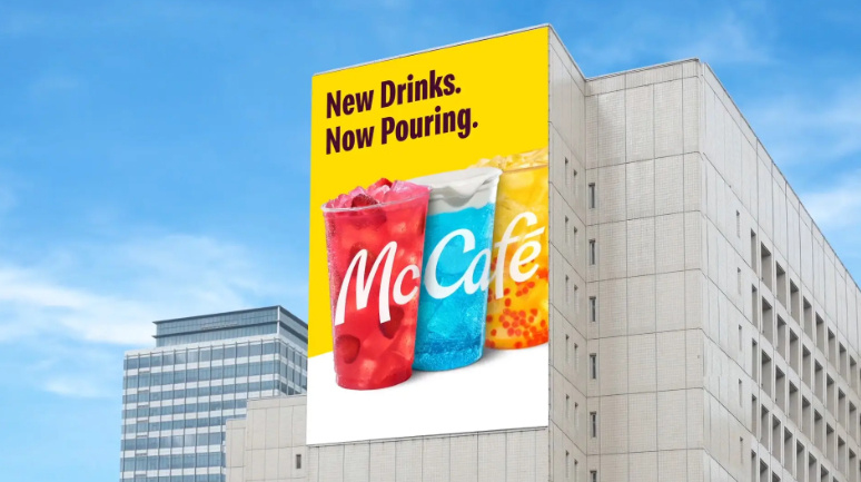
McCafé's brand upgrade—from deep green to coffee cherry red, from static logo to dynamic framework, from category colors to emotional colors—provides a complete evolutionary path for all food and beverage brands. It proves that the most successful food and beverage brand design is not about making the brand look “more expensive,” but about making the brand look “more attuned to consumers” current needs.“ When Gen Z buys a drink not merely to quench thirst but for a moment of relaxation, a small reward, or a form of self-expression, brands must respond to this ”emotional value" through color, typography, and systems. McCafé has done it—what about your brand?