On supermarket shelves, Lay's potato chips' red-and-yellow packaging is one of the most recognizable symbols in the world. But did you know that this brand, with over 200 flavors, almost never displays a photo of its core ingredient—real potatoes—on its packaging?
This subtle detail reveals a profound “perception gap” between the brand and its consumers. Recently, through a brand image upgrade, Lay's has revealed a simple truth: when a brand grows too large and complex, its most powerful move is often to return to its roots. Through a sincere and strategically unified visual identity system, Lay's has not only refreshed its appearance but also repaired its trust contract with consumers, making every bag of chips a messenger connecting land, sunshine, and joy.
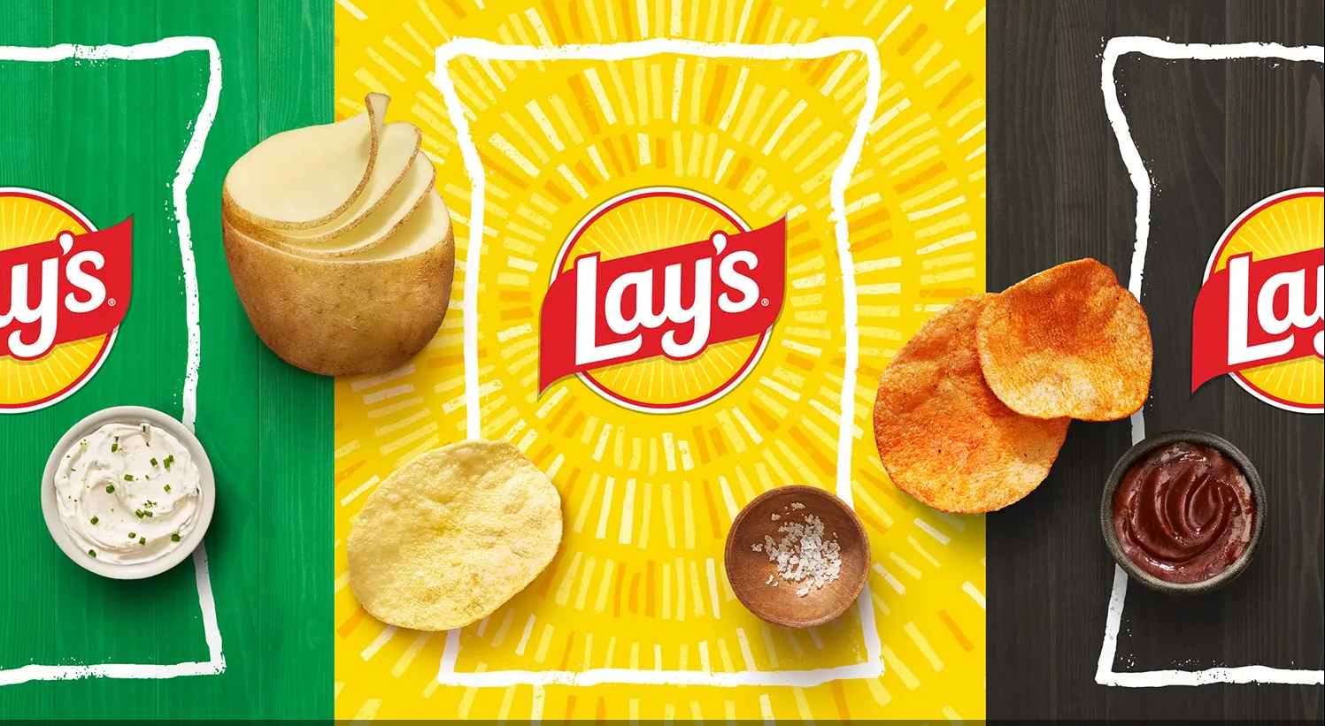
I. Root Cause: When Brand Symbols Lose Connection with Product EssenceAn internal survey conducted by PepsiCo provided concrete data for this disconnect: as many as 42% of Lay's potato chip enthusiasts were unaware that their favorite snack is made from potatoes grown on real farms.
This is a critical brand alert. In an era where healthy eating has become a mainstream value, consumers are increasingly wary of ultra-processed foods. When a brand's core value (“made from real potatoes”) fails to be effectively communicated through its most direct medium—packaging—a trust crisis quietly takes root.
Lay's classic logo, the golden sphere with a red ribbon in use since 1995, was originally designed to symbolize the “sun,” representing warmth and positive energy. However, over years of market communication, it has been more often misread by consumers as “a potato chip” or “a potato.” The brand's visual assets became disconnected from the “sunshine” and “natural growth” imagery it intended to convey.
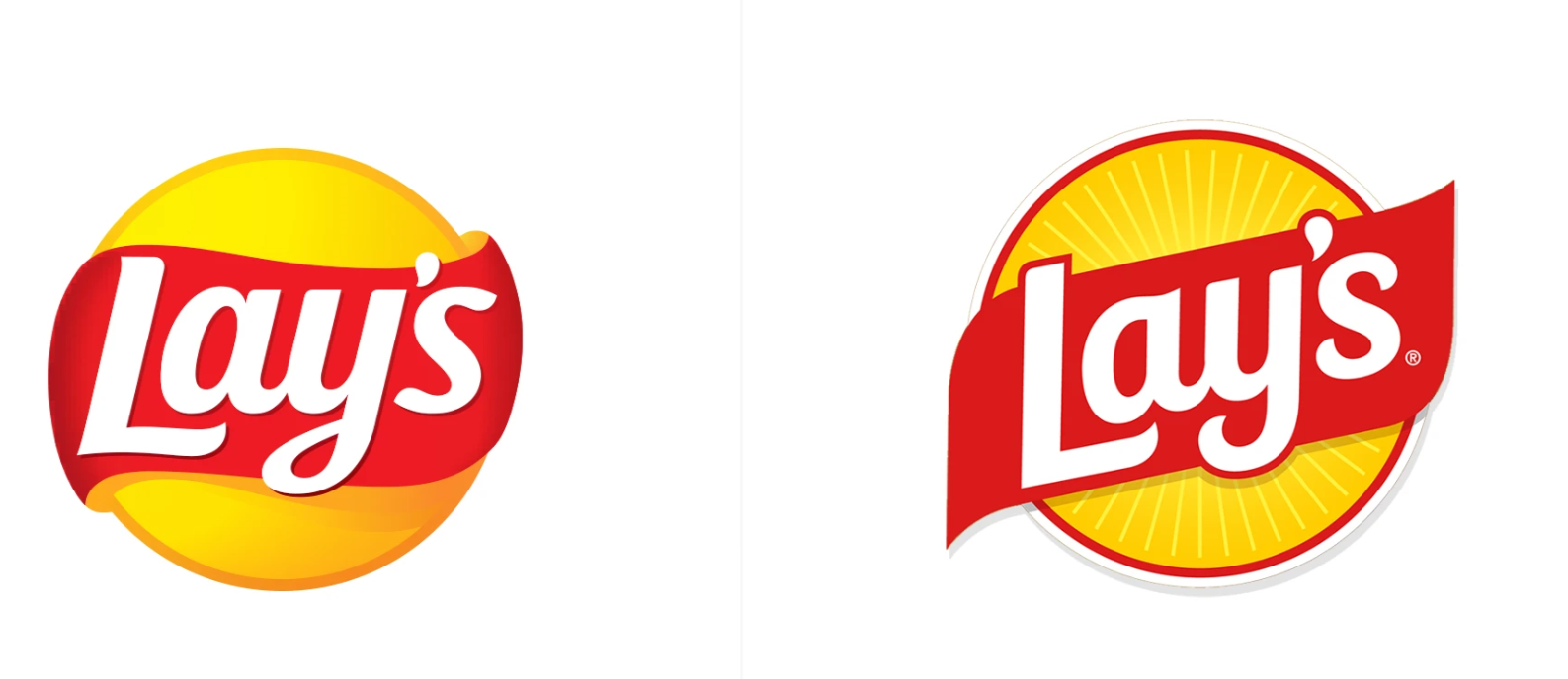
The image above shows the before-and-after comparison of the brand identity upgrade logo design.II. Strategic Pivot: Rebuilding “Authenticity” Perception Through Design Language
Facing this challenge, Lay's launched a brand revitalization program called “Rooted in Real.” This was not a simple visual update but a strategic shift aimed at repairing brand trust, with the core goal of embedding the “real potato” concept into every visual detail.
1. Brand Logo Refresh: Making the “Sun” Truly Shine
The design team did not abandon the classic brand assets; instead, they chose to deepen and clarify them.
Clarifying the Core Imagery: The new logo fully embraces and strengthens the “sun” symbol, shaping it into a warm, vivid visual focal point.
Infusing Human Storytelling: The surrounding red ribbon has been reinterpreted as “a gift from farmers,” while the inner “Lay's light” directly points to the sunlight that nourishes potato growth.
The Most Brilliant Design Decision: These rays of light were not digitally rendered but were hand-printed using real potato slices dipped in ink. This move transcends aesthetics to become a powerful brand statement, materializing the concept of “authenticity” in the most unpretentious and credible way.
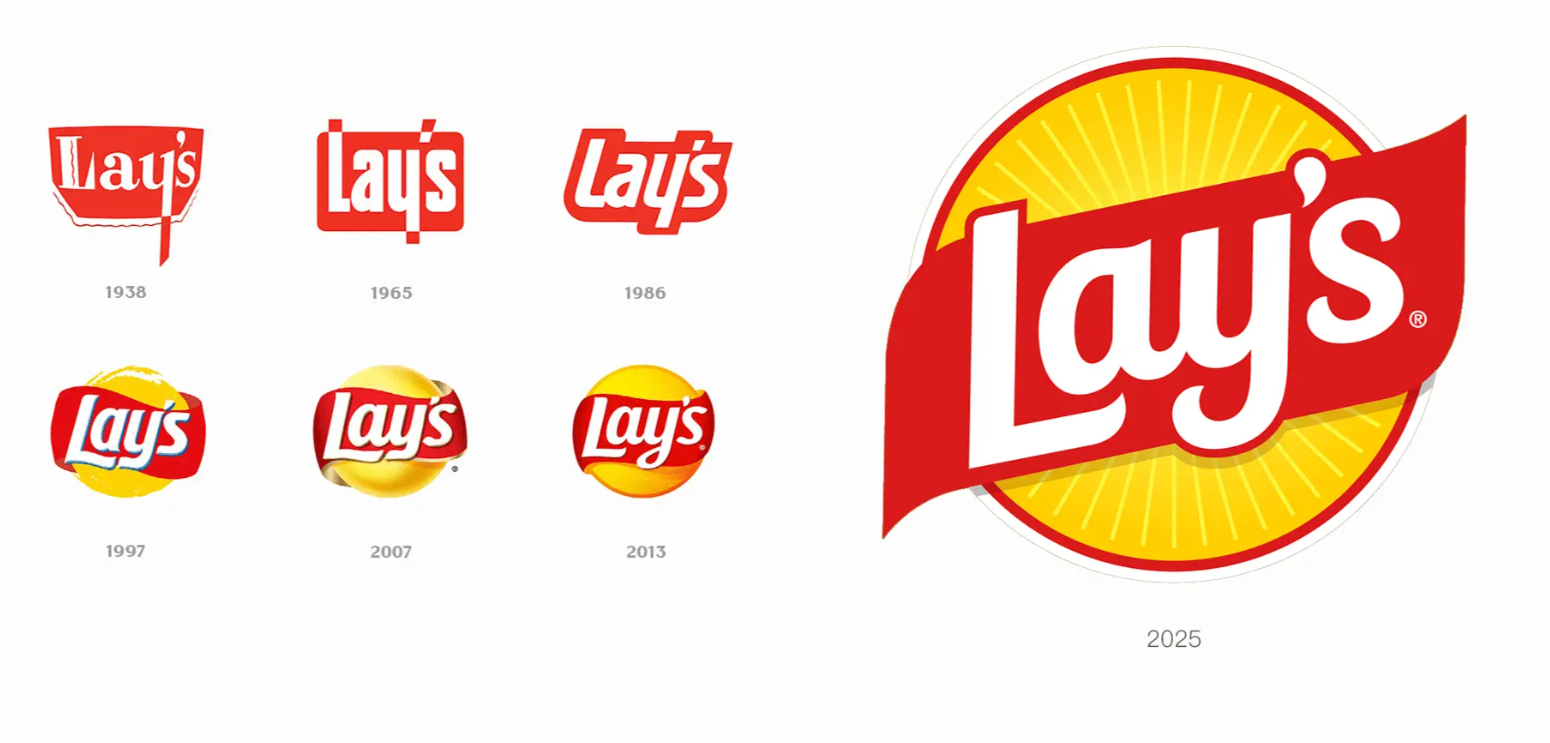
The image above shows the evolution history of the Lay's logo design.
2. Packaging System: Building “Authenticity” on the Shelf”
The design of the new packaging serves two core objectives: “enhancing ingredient awareness” and “improving shelf visibility.”
Ingredient Color Palette: The primary color scheme of the packaging is directly inspired by the ingredients themselves—such as pickle green, pecan brown, and savory red—collectively creating a natural and appetizing atmosphere.
Textural Photography: Enhanced photographic visuals boldly showcase the golden hue and crispy texture of each chip variety, serving as the most confident declaration that the product originates from real ingredients.
Scientific Validation: The design team employed scientific methods such as eye-tracking tests to verify the new packaging's “discoverability” and “information transmission efficiency” in simulated shelf environments. The results confirmed that the new design not only outperformed in recognition speed but also significantly strengthened consumers“ perception that ”chips come from real potatoes."
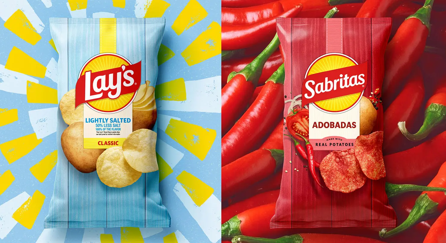
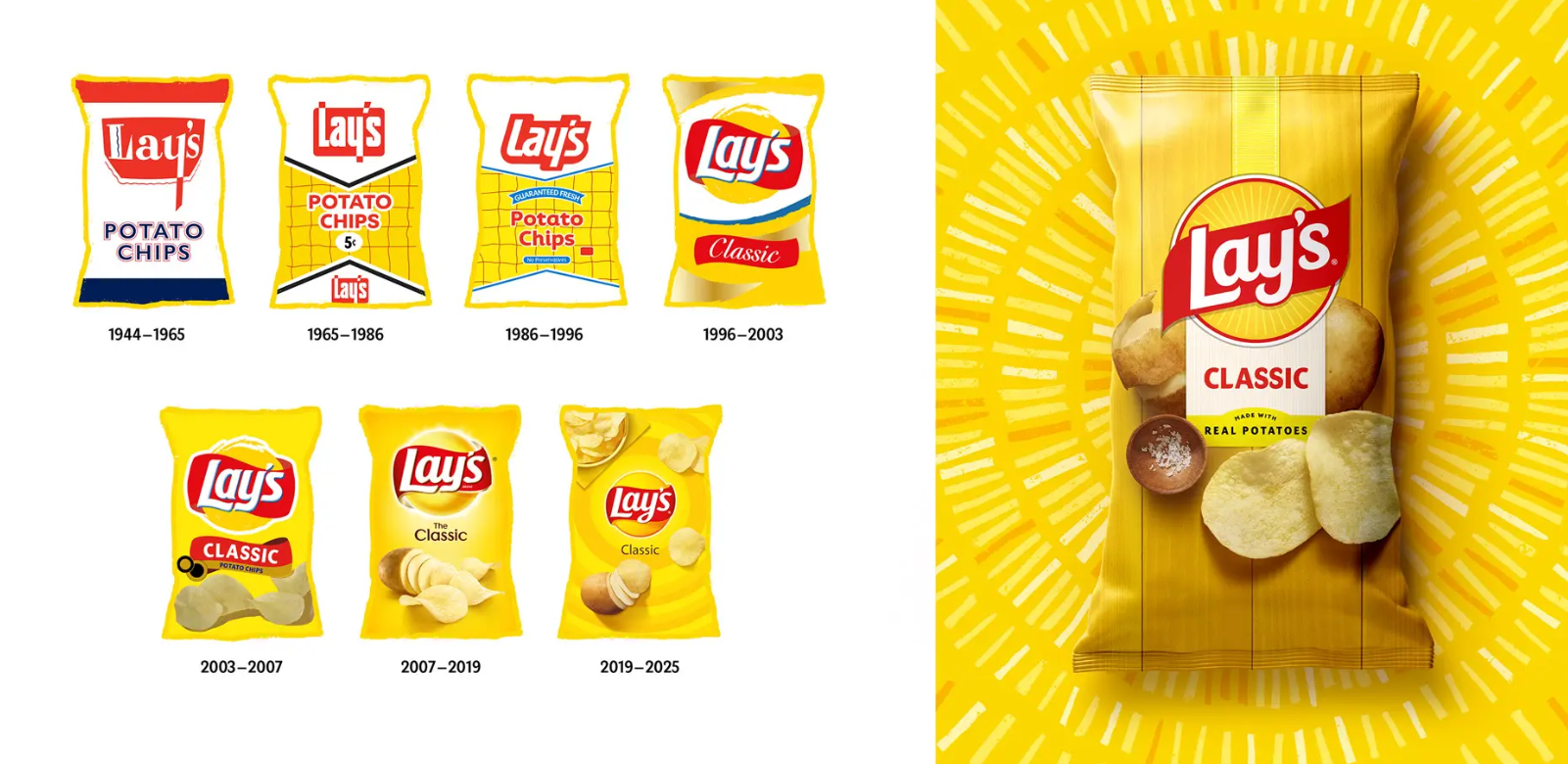
The image above shows the packaging design journey within the Lay's brand VI design.
III. Professional Insights: Three Practical Values from the Lay's Case
Lay's brand VI upgrade provides an actionable guide of significant reference value for all brand owners and designers:
Conduct Regular “Perception Checkups” for Your Brand: Lay's insight began with a specific consumer survey (the 42% perception gap). Does your brand have a similar “perception blind spot”? Regularly examining how users understand your core value through data and research is the first step in preventing brand risk.
Design is “Translation,” Not “Makeup”: Lay's design team successfully “translated” the abstract strategy of “returning to authenticity” into potato-print rays of light, ingredient-derived colors, and highly textural photography. Examine your own design: does it visually deliver on your brand's promise?
In the Digital Age, Invest More in “Offline Shelf Communication”: Although 80% of snack purchases still occur in physical supermarkets, many brands' marketing budgets are heavily skewed toward online channels. The Lay's case proves that packaging is the closest and most frequent communication touchpoint between a brand and its consumers. Optimizing packaging's shelf communication efficiency is an investment that directly drives sales.
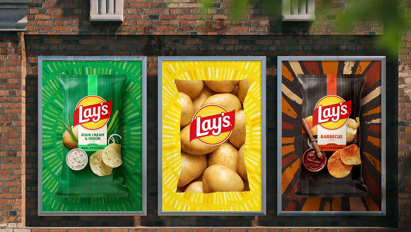
Lay's transformation reveals a simple truth: when a brand grows too large and complex, its most powerful move is often to return to its roots. Through a sincere and strategically unified visual design, Lay's has not only updated its appearance but also repaired its trust contract with consumers, making every bag of chips a messenger connecting land, sunshine, and joy.