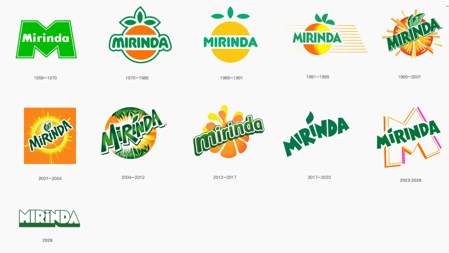
In 2023, the vibrant “M” graphic was just added to the tilted green logo, and in 2026, a comprehensive rebranding is underway once again—Mirinda has undergone two brand upgrades in three years, a frequency rarely seen in the carbonated beverage industry. But this time, what has changed is not just the graphic, but a set of FMCG brand design logic that subverts tradition: making the fruit larger than the LOGO, putting flavor in the spotlight, and enabling consumers to identify the taste within 3 seconds.
I. Strategic Diagnosis: From “Brand-Centric” to “Flavor-Centric”
For the past few decades, the golden rule of FMCG packaging has been “the bigger the LOGO, the better.” Mirinda's design team's retrospective review found that what consumers truly want to quickly obtain in front of the carbonated beverage shelf is not “who produced it,” but “what flavor it is.” No matter how prominent the brand name is, if users cannot tell whether it is orange or strawberry at a glance, they will turn to a more intuitive product nearby.
The core strategy of this upgrade is precisely the shift from “brand-centric” to “flavor-centric.” Flavor becomes the most intuitive and recognizable visual element, while the brand LOGO recedes into a supporting role. This is a fundamental shift in FMCG brand design—from “who I am” to “what you get.”
II. Visual Decoding: Four Disruptive Design Moves
1. LOGO “Buttonization” — Proactive Deference
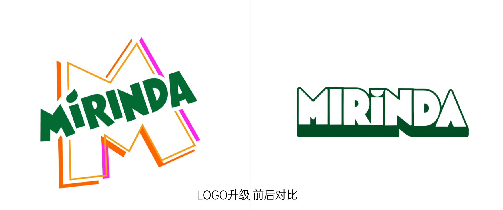
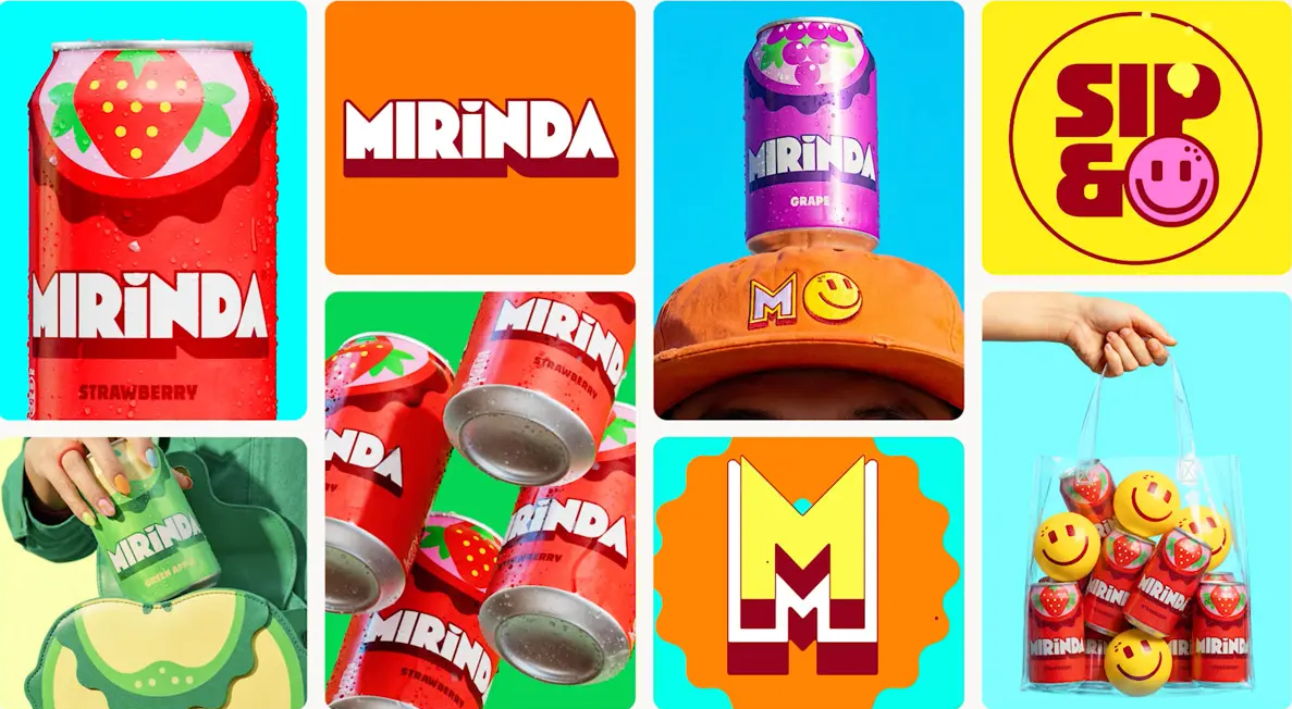
The new LOGO abandons the slanted typeface used for 30 years, replacing it with rounded, bold sans-serif letters arranged in a clean horizontal layout. Pure white bold letters paired with dark outlines and a thick base give the whole design the appearance of a clickable “button.” This design endows the LOGO with stronger visual tension while also preventing it from competing for the leading role on the packaging—consumers' gaze is guided toward the oversized fruit graphic below. This is a rare act of self-restraint in beverage brand design.
2. Exaggerated Reconstruction of Fruit Symbols
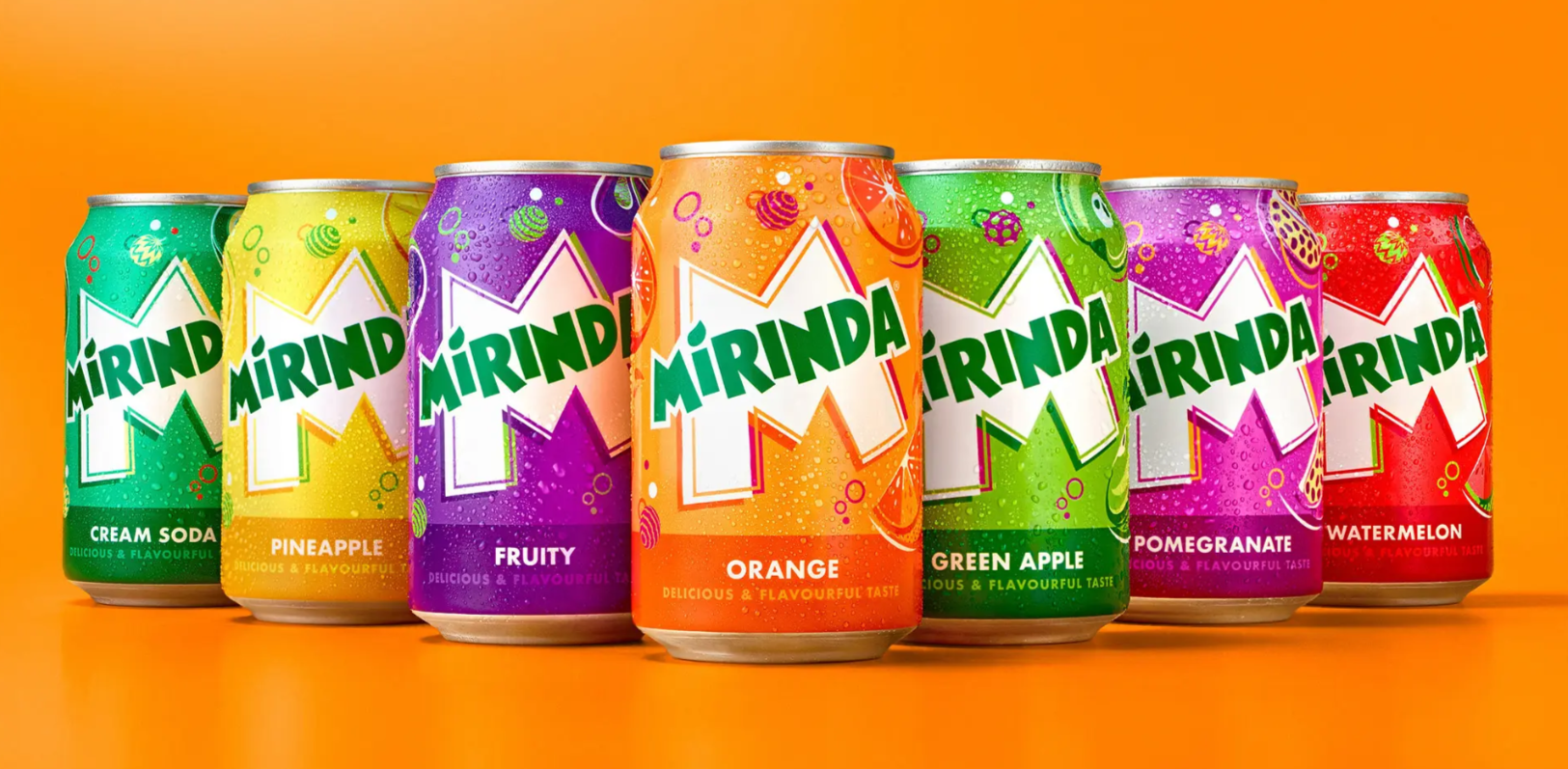
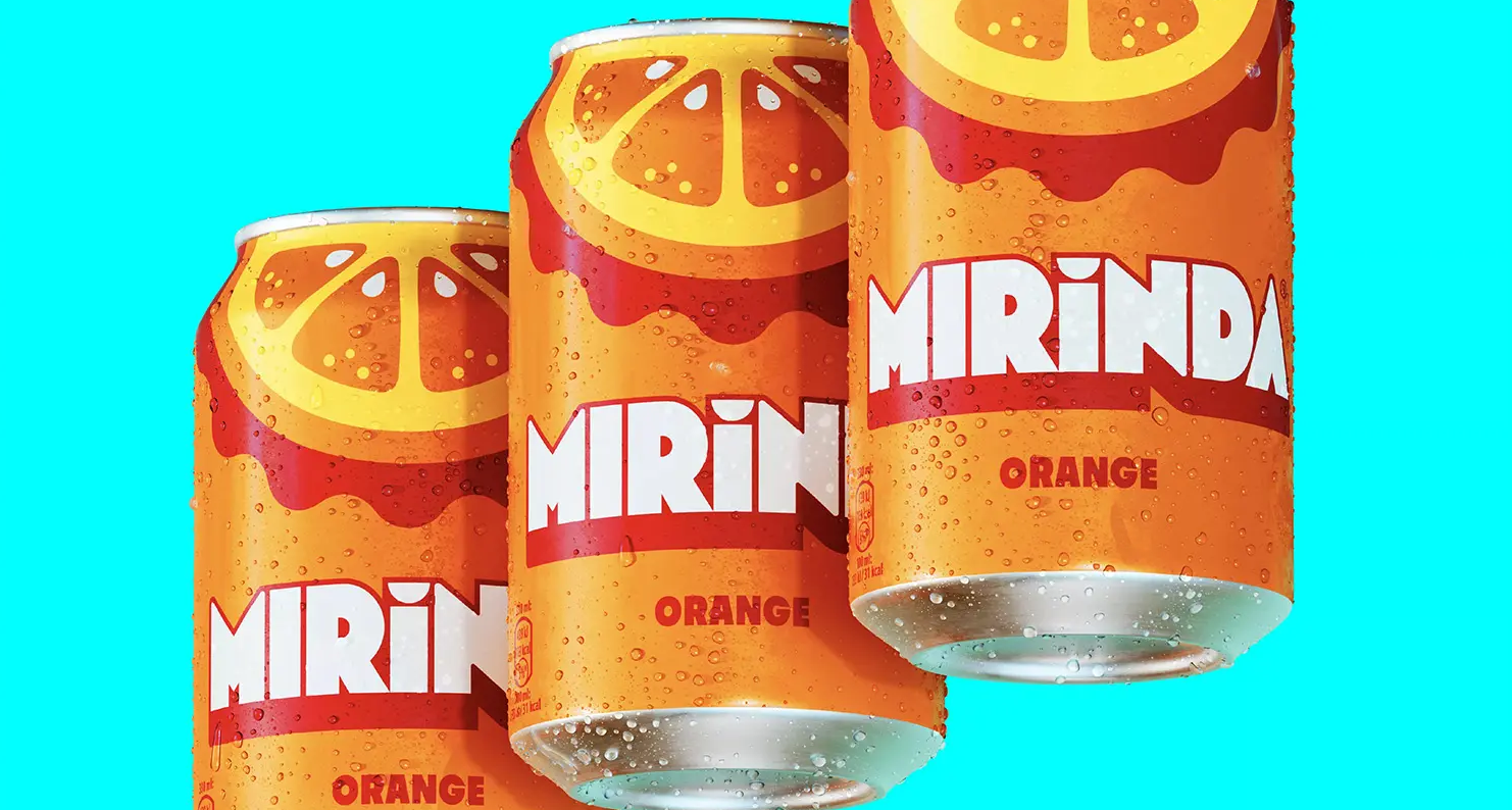
Based on simplified semicircular structures, fruit cross-sections are constructed at multiple times their original scale—orange segments, strawberry seeds, and grape clusters. These graphics occupy the primary visual space of the packaging, allowing consumers to identify the flavor at a glance even when placed on the bottom shelf. This is the core goal of beverage packaging design: information delivery faster than aesthetic judgment, function prioritized over decoration.
3. Dynamic Color System and Retro Symbols
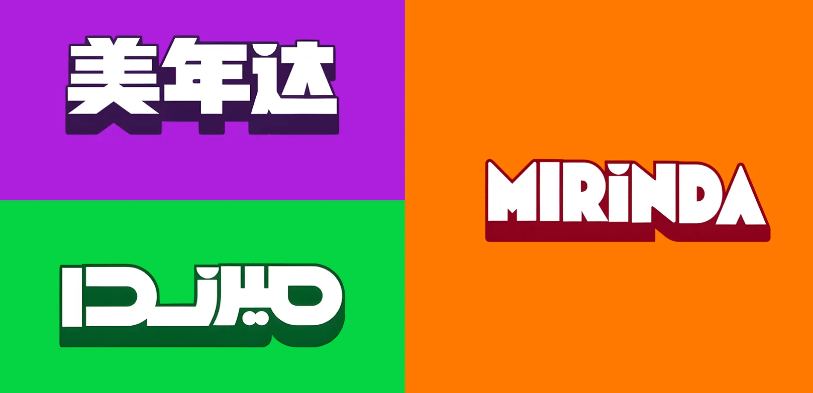
The LOGO's outline and background color vary with flavor: grape purple, strawberry red, orange orange, and apple green. Color becomes a second layer of flavor language—recognize the flavor by color from afar, confirm the choice by fruit up close. Meanwhile, the semicircle atop the second letter “i” replicates the classic orange element from the 1970s–1990s, flexibly transplanted into the Chinese and Arabic wordmarks—building a brand moat with historical assets.
4. Custom Typeface Strengthening System Consistency
The brand simultaneously launched a custom typeface, "Mirinda Burst," whose distinctive character forms a unified visual rhythm with the fruit graphics. From LOGO to packaging to typography, Mirinda has built a complete brand identity system, providing a unified framework for global application.

III. Professional Insight: The Underlying Logic of Reverse Operation
Mirinda's upgrade this time is essentially a “reverse operation” in the field of beverage image renewal:
Visual hierarchy reversed:Previously, the brand LOGO was the largest → now the fruit graphic is the largest
Information priority rearranged:Previously, the brand name came first → now flavor information comes first
Design objective shifted:Previously, the goal was brand exposure → now the goal is decision-making efficiency
Behind this logic lies a profound understanding of the essence of FMCG shelf competition: in scenarios where consumers spend extremely limited time, whoever enables users to obtain the desired information fastest wins the purchase.
IV. Three Takeaways for All FMCG Brands
Rethink visual hierarchy:In categories with extremely short decision times, the recognition priority of product attributes (flavor, specification, efficacy) should be higher than that of the brand LOGO.
Use graphics to replace text:An enlarged fruit cross-section is faster, more accurate, and more language-barrier-free than the words “strawberry flavor.”
Systems over single points:From LOGO, color, and typeface to cross-language versions, unified output is the only way to achieve true shelf dominance.
Mirinda's bold practice of rebranding twice in three years offers a new direction for FMCG brand design. When the fruit graphic is 10 times larger than the LOGO, when the color system serves flavor, and when retro symbols are reactivated—this beverage has already gained the upper hand on the shelf. Every FMCG brand should ask itself: whose voice is my packaging still speaking for?