On May 7, 2026, Google officially upgraded the Fitbit app to Google Health and unveiled a new brand identity—a heart-shaped icon composed of a blue, green, yellow, and red/purple gradient. This is not merely a product name change, but a profound strategic brand transformation.
As a company specializing in brand design and strategy, we recognize Google's pivotal pivot in the health sector: evolving from a “data tracking tool” to an “AI-driven health management partner.” This article will deconstruct the visual logic, color strategy, and market intent behind this upgrade from a brand design perspective.
I. From Dots to Heart: The “Semantic Leap” of the Brand Symbol”
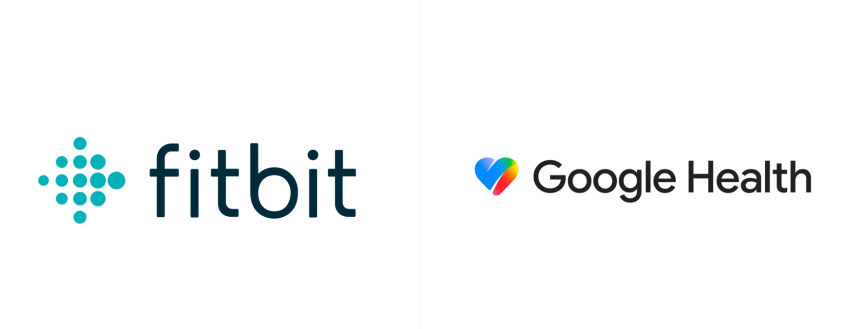
The original Fitbit icon consisted of multiple colored dots, which was abstract and required a certain learning curve. Users often only understood that it represented data points such as “activity,” “heart rate,” and “sleep” after prolonged use. While this design conveyed a sense of technology, its emotional communication was ambiguous.
In contrast, the new Google Health icon employs a brushstroke-style solid heart, directly visualizing the core values of “health,” “care,” and “life.” The heart is a universally recognized emotional symbol that requires no explanation and is understood at a glance. This exemplifies the power of “archetypal symbols” in brand design—reducing cognitive cost while enhancing emotional resonance.
The first principle of brand design: enable users to perceive “who you are” within one second. The new Google Health icon achieves this.
II. Gradient Color System: The “Visual Passport” to the Google Ecosystem”
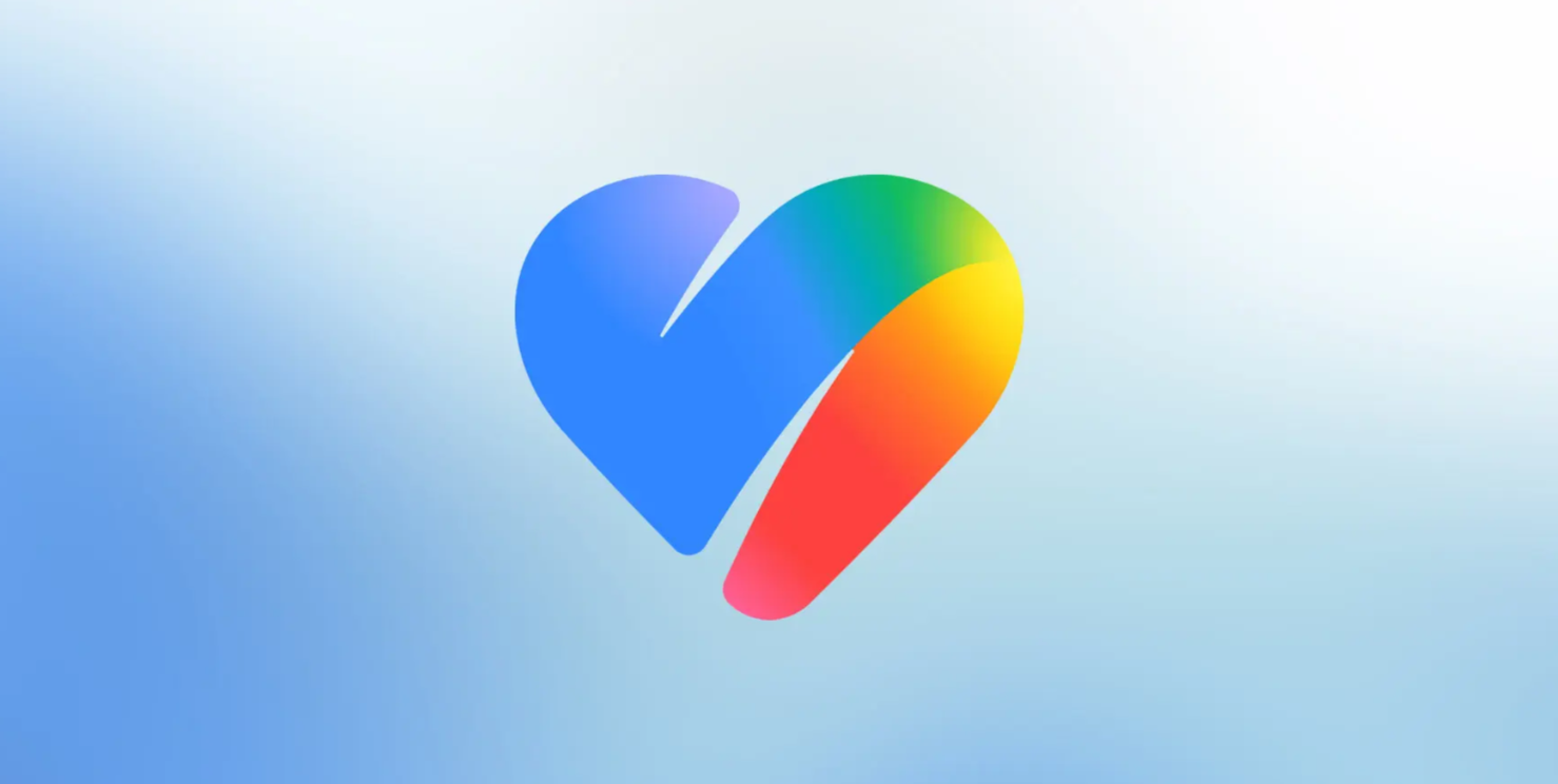
One of the most striking features of the new icon is its four-color gradient:
Blue → Green → Yellow → Red/Purple
This is Google's signature design language in recent years. From Google Maps and Google Photos to the Gemini app, similar gradient logic has been adopted. The inclusion of Google Health aligns it visually as part of a unified array within the broader Google ecosystem.
From a brand design perspective, this is a successful practice of “family design”:
Differentiation:The heart-shaped outline distinguishes it from Maps' pin and Photos' pinwheel, maintaining independent recognizability.
Unity:The shared color system instantly signals to users that “this is a Google product.”
Modernity:The gradient departs from flat monochrome, conveying a brand temperament of vitality, innovation, and dynamic progress.
Before-and-after comparison of the brand logo design upgrade
III. From “Fitness” to “Health”: Elevating Brand Positioning
A change in name often signifies a restructuring of brand positioning:
Dimension | Fitbit | Google Health
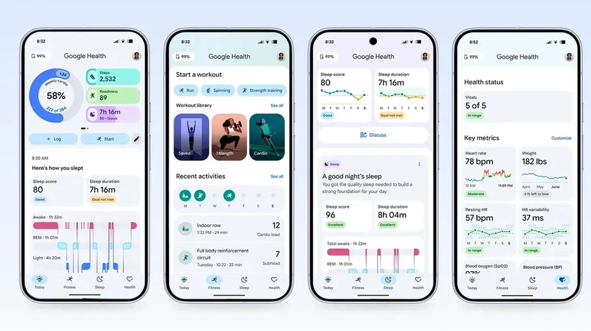
Scope | Focused on exercise, steps, sleep | Encompasses vital signs, medical records, resilience assessment
Role | Data tracking tool | AI health coach + unified data portal
Emotion | Motivation, quantification | Care, comprehensiveness, proactivity
Ecosystem | Relatively closed (primarily Fitbit hardware) | Cross-platform (supports Apple Health, Health Connect)
Google Health is no longer just “helping you track how many steps you've taken,” but aims to become the lifelong health data hub for users. The heart-shaped icon is the visual expression of this strategy: technology is no longer cold numbers, but a warm guardian of health.
IV. Color Psychology: How Does the Gradient Convey Trust and Vitality?
Let us delve deeper into the color choices of the new icon:
Blue → Trust, professionalism, technology (a classic color in the healthcare sector)
Green → Life, growth, health (nature and vitality)
Yellow → Energy, optimism, vibrancy (motivating user action)
Red/Purple → Care, compassion, personalization (core area of the heart, reinforcing emotion)
The fusion of these four colors creates a composite perception of “technology + life + energy + care.” This aligns closely with the brand message Google aims to convey: rigorous, scientific health management combined with friendly, warm AI companionship.
V. Implications for Our Brand Design Agency
This brand upgrade by Google offers us several important design considerations:
The power of symbols outweighs decoration: a clear, universal symbol (the heart) is more effective than a combination of multiple abstract dots.
The color system is the backbone of a brand: gradients are not merely aesthetically pleasing but serve as a powerful tool for establishing ecosystem belonging.
Brand positioning dictates design direction: from “tracking” to “management,” from “tool” to “partner,” design must serve strategy.
Simplified but not simplistic: the new icon removes redundant elements while retaining depth and quality through the gradient color scheme.
The brand refresh of Google Health is a textbook example of coordinated brand strategy and visual design evolution. It demonstrates that as product functionality continues to advance, the brand identity must be simultaneously restructured to truly carry new user value and market ambition.