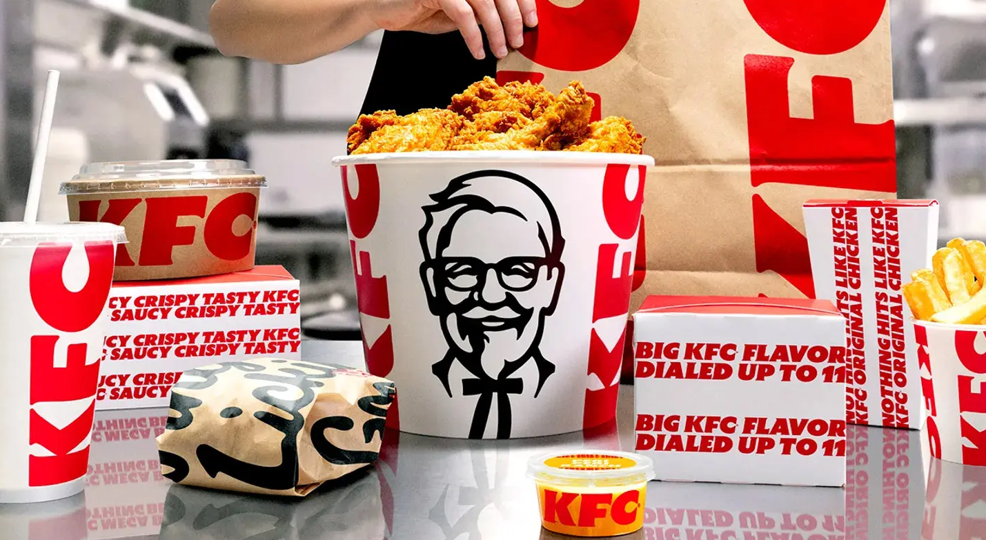
In June 2026, KFC announced the launch of a global brand upgrade initiative named "Next Chapter," encompassing menu updates, restaurant design, and brand visual refresh, which will progressively cover more than 34,000 stores across over 150 countries and regions worldwide. This marks another significant brand image evolution for KFC, following the introduction of the bucket-shaped frame logo in 2018. This article provides an in-depth analysis of the design implications, concepts, and underlying commercial logic of the KFC brand upgrade from a professional perspective on FMCG restaurant brand design and brand strategy, offering a replicable methodology for restaurant brand image upgrades.
I. Strategic Background: Setting a New Standard for Modern Chicken Dining
KFC stated that, with the continued growth of global consumer demand for chicken products, the company hopes to take this opportunity to “set the standard for modern chicken dining.” This strategic positioning determines that this restaurant brand image upgrade is not merely a visual “logo change” but a systematic reconstruction from product to experience. On the menu front, KFC plans to expand its boneless chicken product line, launch more than 20 localized flavor sauces, and extend its beverage line “KWENCH by KFC.” The brand upgrade and product innovation are advancing in tandem, aiming to enhance customers' reasons to visit at different times of the day and build a more complete consumption scenario.
II. Logo Design Decoded: Three Core Changes
This FMCG brand design was executed by the globally renowned creative agency Jones Knowles Ritchie (JKR). JKR's Global Chief Creative Officer, Tosh Hall, stated that KFC is one of the most representative brands in the fried chicken category, and the team's mission was to ensure that this category-leading brand presents itself as “the best, the most appealing, and the freshest.” Based on this philosophy, the new logo retains its core identity while undergoing three key adjustments:
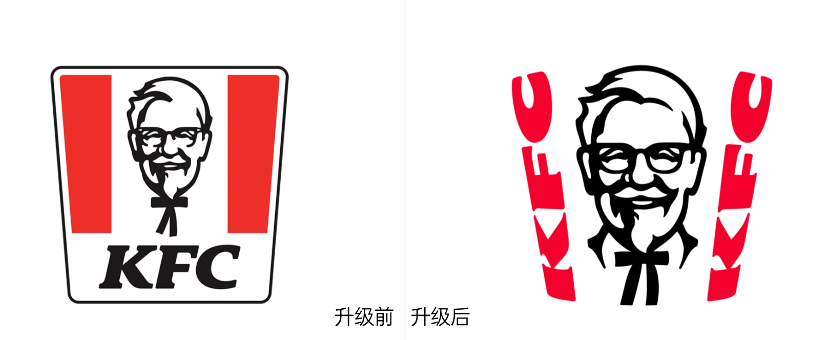
1. Bucket-Shaped Frame: From Closed to Open
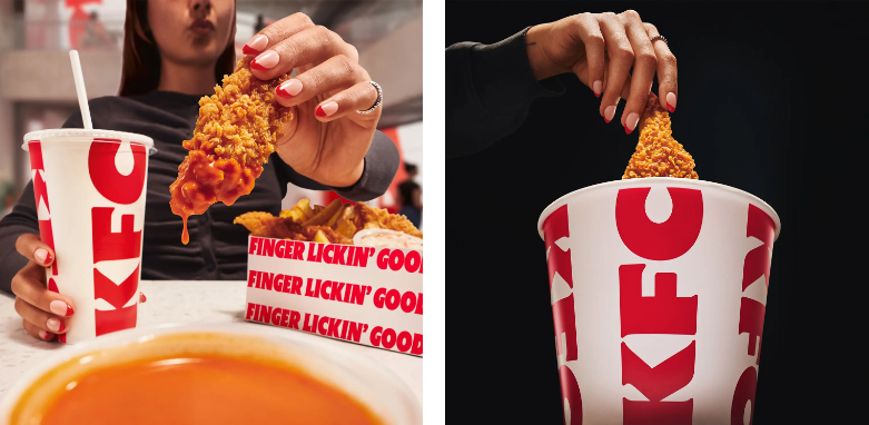
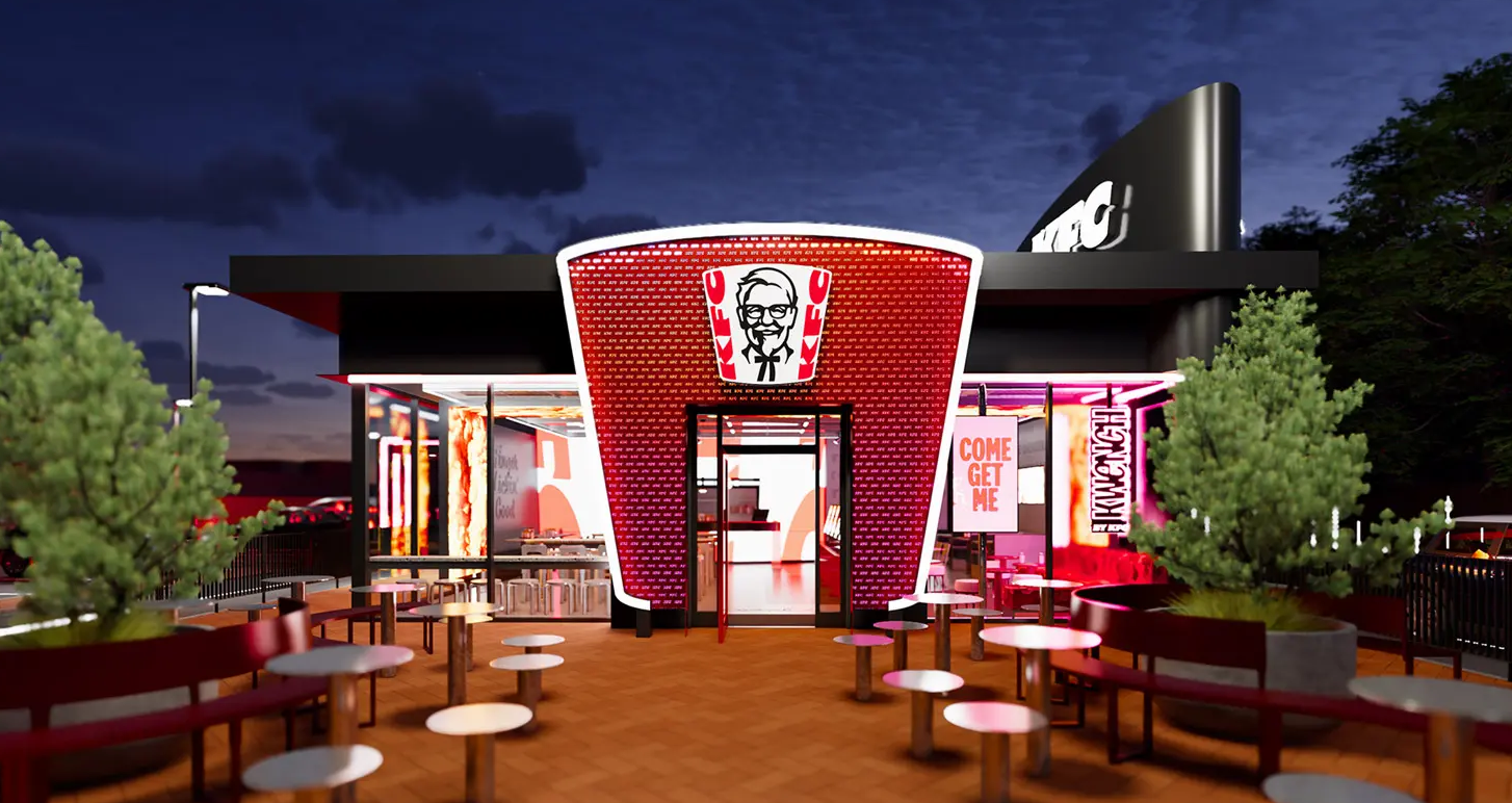
Since 2018, the KFC logo has featured a bucket-shaped frame enclosing Colonel Sanders“ portrait to reinforce its association with the product form. In this upgrade, the bucket shape is retained, but the black outline has been removed, the black ”KFC“ text at the bottom has been eliminated, and the red stripes on both sides have been replaced with two rows of curved red ”KFC“ lettering. This change transforms the bucket-shaped frame from a ”closed graphic boundary“ into an ”open spatial framework,“ making it visually more transparent while also giving the bucket structure a more authentic three-dimensional feel. From the perspective of logo design implications, this ”de-bordering" treatment conveys a more open and extensible brand posture, reserving visual space for future product line expansion.
2. Colonel's Portrait: Refined Details, Eliminating Visual Misinterpretation
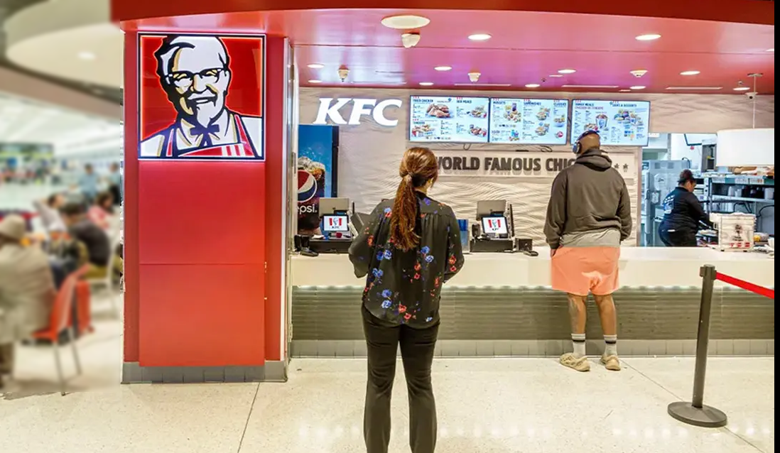
Colonel Sanders“ portrait is KFC's most recognizable brand asset. This upgrade adds details on both sides of the shirt collar and redraws the necktie. The newly added black collar resolves the long-standing visual ambiguity in which consumers mistook the ”bow tie for the Colonel's two slender legs.“ This detail correction may seem minor, yet it reflects the ultimate pursuit of ”recognition clarity“ in FMCG brand design—every refinement of a classic symbol is aimed at eliminating cognitive noise, allowing consumers to ”recognize it at a glance."
3. Typography Optimization: Bolder, More Modern
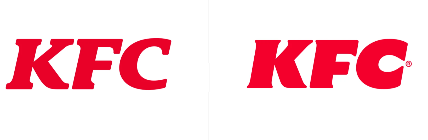
The serif wordmark that KFC has used since 2006 has been redesigned in this upgrade. While the new typeface retains the primary characteristics of the original wordmark, the strokes are bolder and the serifs are further subdued. In practical application, the “KFC” lettering can still appear independently of the logo, consistent with the design of all KFC logos since 1991. The bolder typeface offers better legibility and visual impact across diverse scenarios such as digital screens, store signage, and delivery packaging, while also aligning with the current graphic design trend of “simplification and increased visual weight.”
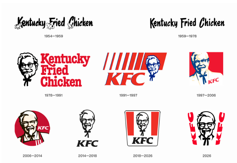
III. Brand Evolution History: Eight Iterations from Handwritten Wordmark to Bucket Structure
Since its founding in 1930, KFC's brand image has undergone eight major transformations. In the 1950s, a handwritten-style typeface and full brand name were adopted; the 1960s introduced the Colonel Sanders image; 1978 saw the first comprehensive brand image redesign, establishing a standardized visual system; 1991 abbreviated “Kentucky Fried Chicken” to “KFC”; 1997 upgraded the Colonel's portrait to a more refined rendering; 2006 introduced the longest-used version, replacing the tuxedo with a red apron; 2014 attempted a simplified logo retaining only the portrait and “KFC” lettering; and 2018 introduced the bucket-shaped frame structure, reinforcing the association with the product form. Each iteration reflects the brand's strategic focus and cultural context within different business cycles.
IV. Professional Insights: Three Key Principles for Restaurant Brand Image Upgrades
Principle One: Leading Brands Must “Lead” Rather Than “Follow”
JKR's design philosophy explicitly states that the responsibility of a category-leading brand is to define the standard of “the best, the most appealing, and the freshest.” Brand visuals must not only keep pace with the times but should also be appropriately ahead of them, setting the aesthetic direction for the industry.
Principle Two: Brand Assets Should Be “Refined” Rather Than “Overthrown”
KFC did not abandon core assets such as Colonel Sanders, the bucket-shaped frame, or the KFC abbreviation. Instead, it optimized details—bolding the typeface, refining the portrait, and opening up the frame. This strategy of “evolution rather than revolution” both reduces consumers' cognitive costs and keeps the brand feeling fresh.
Principle Three: Visual Upgrades Must Be Synchronized with Product Strategy
KFC's restaurant brand image upgrade is not an isolated logo change but is advanced in tandem with product initiatives including the expansion of the boneless chicken product line, sauce innovation, and the “KWENCH by KFC” beverage line. Brand strategy serves commercial strategy, rather than designing for design's sake.
V. Conclusion: The “Next Chapter” of Brand Upgrade”
KFC's “Next Chapter” conveys brand confidence through a more open bucket-shaped frame, responds to consumers“ visual expectations with a more refined Colonel portrait, and adapts to the communication needs of the digital age with bolder typography. In the increasingly competitive fast-food industry, brand image serves as a critical entry point for consumer decision-making. Through this systematic KFC brand upgrade, the company sends a clear signal to global consumers—this fried chicken giant not only knows how to fry chicken well, but also knows how to keep the brand perpetually fresh in consumers” minds. For all brands in their mature phase, the KFC case demonstrates that the most successful FMCG brand design does not make a brand look “completely new,” but rather makes it look like "it was always meant to be this way."