Microsoft's 50th Anniversary Visual Identity: A Carefully Orchestrated “Digital Nostalgia” and Brand Reinvention—from the “Blue Screen of Death” to “Rainbow Pixels,” Decoding How Microsoft Uses Design Language to Engage in Dialogue with a New Generation.As Microsoft celebrates its 50th anniversary amid the global AI wave, its visual identity did not opt for the solemn approach commonly adopted by tech giants. Instead, it astonished the world with a visual spectacle steeped in “Y2K aesthetics.” As brand designers, what we see is not merely a visual system, but a textbook-level brand dialogue—Microsoft is using design language to complete its transformation from “technology authority” to “cultural partner.”
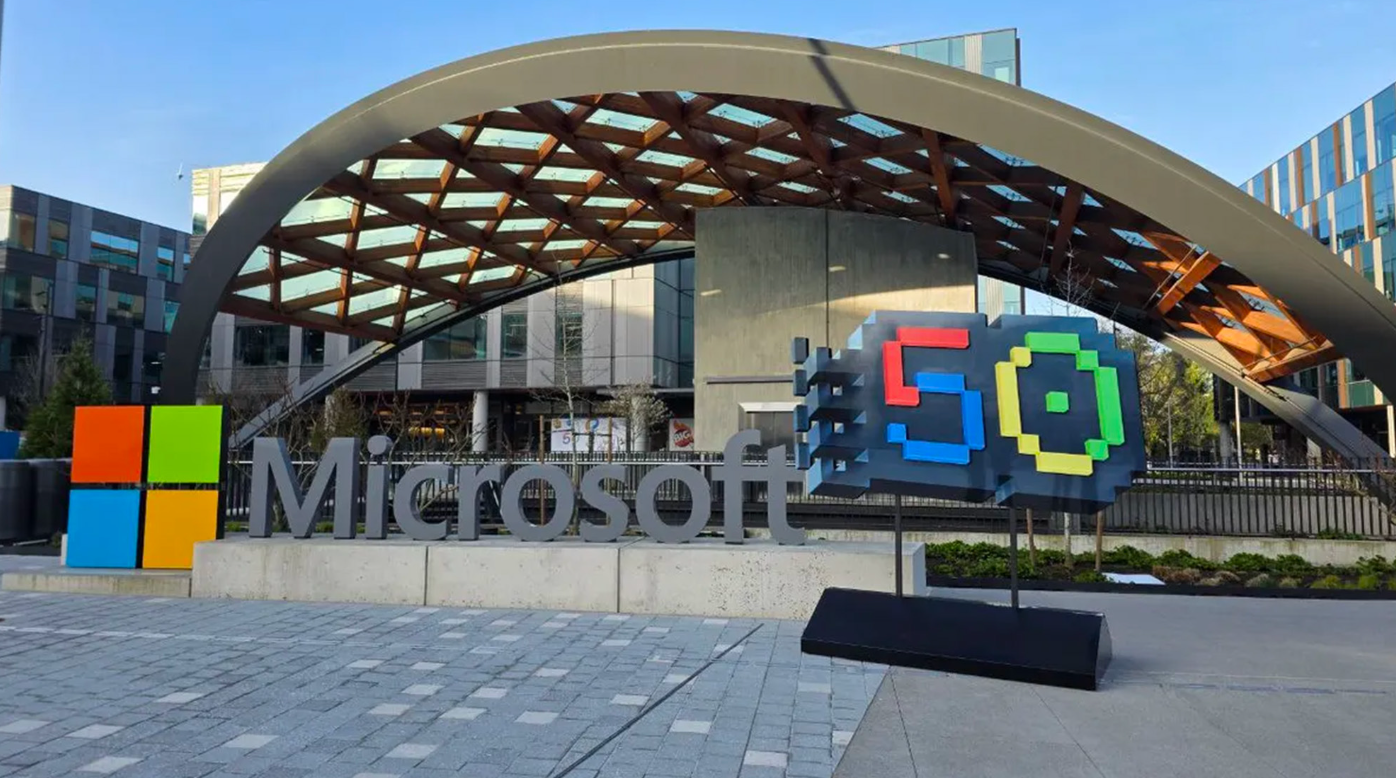
Brand Design Strategy: The Courage to Embrace Imperfection
Microsoft's most groundbreaking choice this time lies in its candid embrace of its own “checkered past.”
A Design Philosophy That Defies Convention:
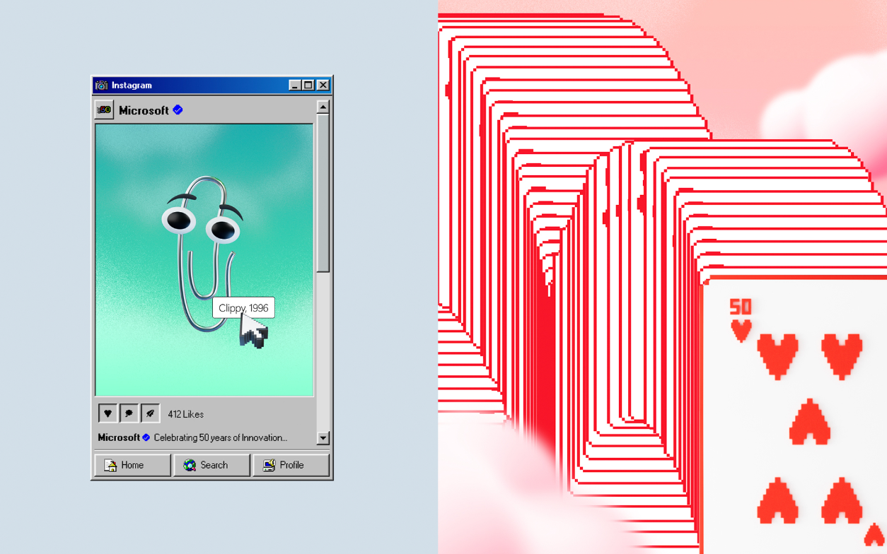
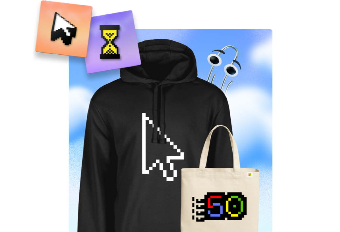
Reinterpreting former “symbols of failure”—such as the “Blue Screen of Death” and the Clippy assistant—as cultural assets
Breaking the stereotype that tech brands must be “flawless,” revealing the brand's humanized appeal
Using self-deprecation and humor to dissolve the distance of a large corporation and forge emotional connections
This strategy reflects the brand's mature confidence—only by daring to look back at where it came from can it better face the future.
Visual Logic: A Multi-Layered Narrative Structure
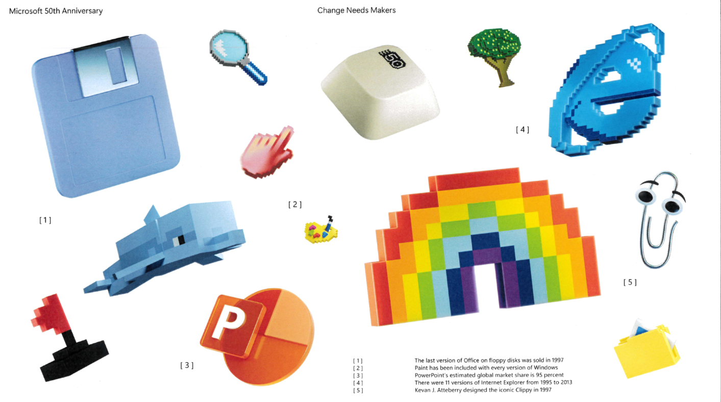
The brand design team constructed a sophisticated “digital archaeology” system:
1. Emotional Transitions Through Color
High-saturation gradients evoke collective memories of the millennial generation
The shift from corporate blue to rainbow hues symbolizes the repositioning from “tool” to “creative partner”
The use of dynamic particles metaphorically represents data flow and the characteristics of the AI era
2. A Dialogue Across Time and Space Through Symbols
The Windows pane evolves into the numeral “50,” completing the visual heritage of brand assets
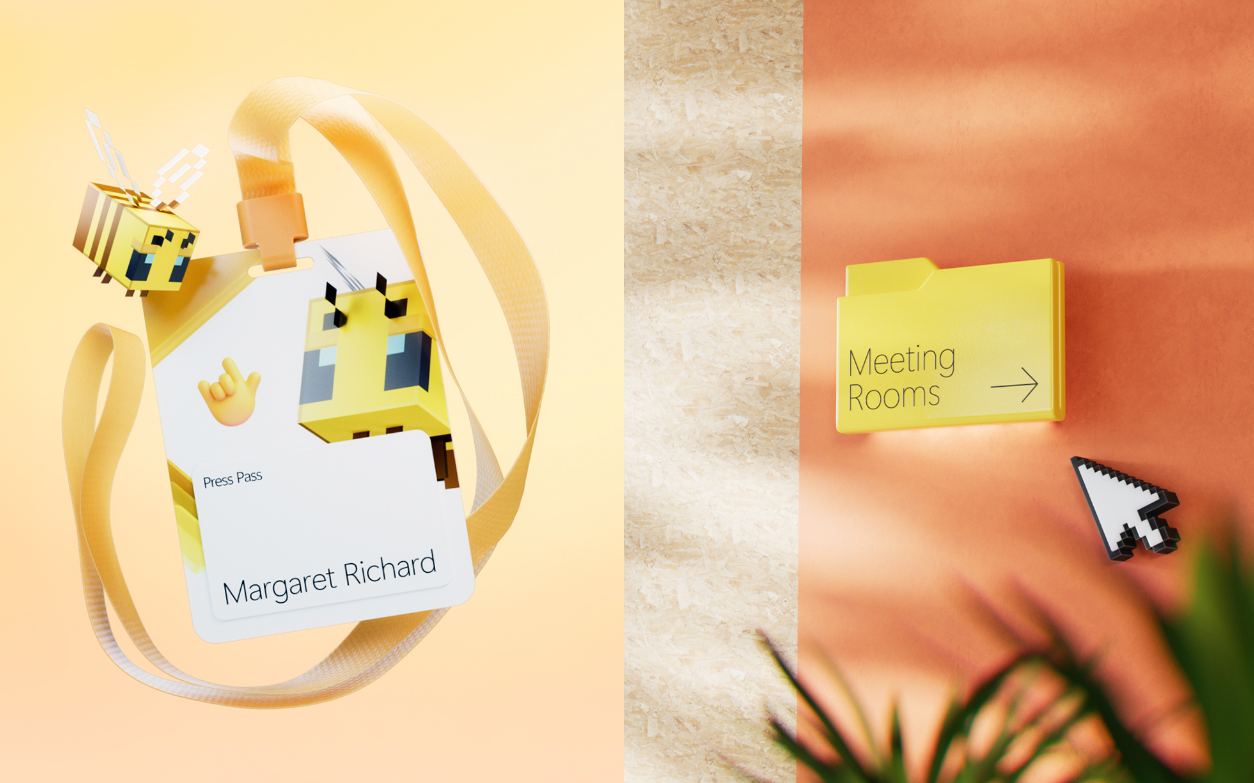
The incorporation of Minecraft pixel blocks showcases the inclusiveness of the Microsoft ecosystem
A modern reinterpretation of the XP screensaver injects new-era vitality into nostalgia
3. Emotional Resonance Through Motion Effects
The mesmerizing rotation of floating panes recreates the distinctive visual rhythm of the digital age
The aggregation and dispersion of particles echo the technical essence of cloud computing and distributed collaboration
Target Insight: A Precise Three-Way Dialogue
This visual system simultaneously engages in dialogue with three key audiences:
For Nostalgic Tech Enthusiasts:
By resurrecting “digital fossils” such as Clippy and the Internet Explorer icon, it satisfies this group's longing for the golden age, transforming the history of technological evolution into emotional capital.
For the Investment Market:
Through a vibrant visual language, it tangibly demonstrates that Microsoft retains its innovative vitality, countering the stereotype of a “middle-aged giant.”
For Internal Employees:
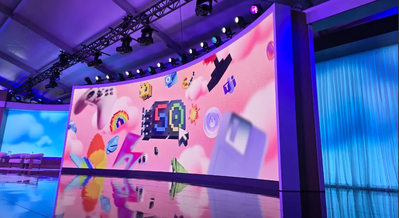
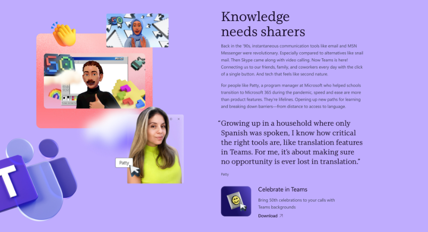
It provides 220,000 employees with a tangible vehicle for cultural identity, reinforcing the organizational identity of “who we are” through Teams backgrounds and office spaces.
The Ultimate Value of the 50th Anniversary Visual Identity Is DialogueThe success of Microsoft's 50th anniversary visual system lies in its transcendence of mere celebratory function, becoming a profound cultural dialogue. When educational institutions consider brand building, the more pertinent questions are: Is our design engaging in sincere dialogue with our target audience? Have we embedded sufficient emotional codes within the visuals? Are we using design language to tell our own unique story? In an era of scarce attention, good design is not only an expression of beauty, but also the embodiment of strategy—a bridge connecting past and future, technology and humanity, institutions and individuals.